

Welcome to this overview of some free python code that uses the Deribit API to pull in and display historical funding rate data for the perpetual contracts on Deribit.
The GitHub repository can be found here.
This program only uses the get_funding_rate_history endpoint, however as only a month of data is pulled with each request, the function in main.py that calls this endpoint has been rate limited in the code to 5 requests per second. This means if you call data for longer periods it will take a few seconds to load the charts.
If you plan to use this (or whatever you build with this) to continue to track the funding on an ongoing basis, it would of course make sense to store the data locally that is pulled from the API, and then only request any new data as required.
Using the program
Once you’ve done any required testing, one of the first things you will likely want to do is connect to the production version of the Deribit site instead of the testnet. To do so, edit the settings.py to the production site by changing ‘test’ to ‘www’. The testnet data is not the same at all so you will need to connect to the production site to get useful data. The only endpoint that is used is a public endpoint, so there’s no need to manage different API keys for each version of the website.
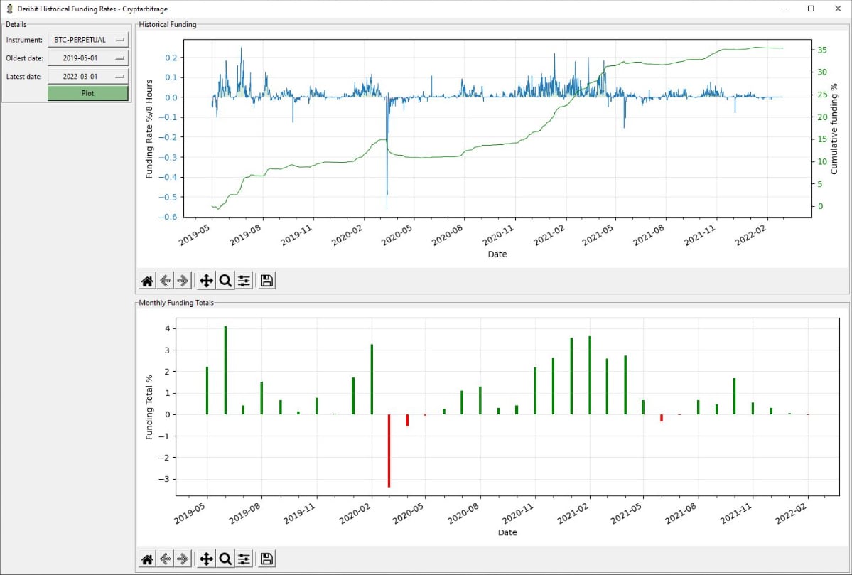
When the code is run, the user has 3 inputs. They can select the instrument, oldest date, and latest date.
Instrument – Which perpetual contract is being looked at.
Oldest date – This is how far back the data will attempt to be pulled from. The first full month of data for the oldest perpetual contracts on Deribit (BTC and ETH) is May 2019, so that’s the oldest date I’ve coded it to list.
Latest date – This allows the user to stop requesting data past a certain date, reducing the number of API requests needed, and allowing for specific periods to be studied more closely. If this setting is set to a date that is before the start date, it will default to requesting the data up to the start of the present month.
The charts
Once the ‘Plot’ button is clicked, two charts are generated. The first displays the 8 hour funding rate over time, as well as the cumulative funding over the same time period. The cumulative amount can be useful for estimating the total percentage of a position size that would have been paid/received over a certain time period.
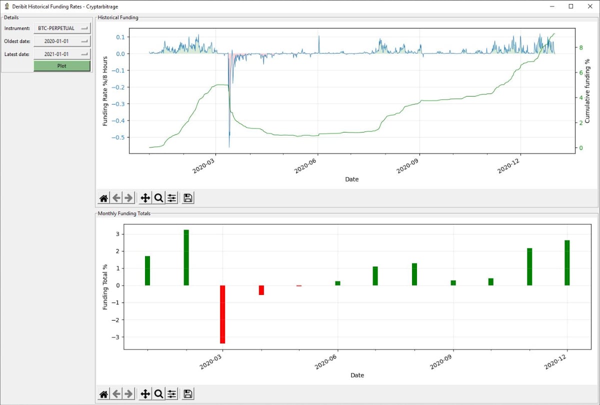
The second chart shows monthly funding totals. This gives a less noisy view of funding trends while also giving an indication of total cost/revenue from funding for each month.
Python UI libraries
Tkinter is used for the GUI, and Matplotlib is used to plot the charts.
Using the code
This code is free for all to use and edit, and I hope this code saves some of you some programming time. As with all the code I’m posting at the moment, I hope each program is useful as it is, but they are also meant to be building blocks with which you can build your own more personalised applications.