The new version of the UI has made the transition out of beta and is now launched as the main web trading portal on deribit.com.
If you’re making the transition from the old layout, you will notice some useful new features, but also that a few things have moved. I’ll try to cover most of the big changes, as well as the improvements that should improve your experience while trading on Deribit.
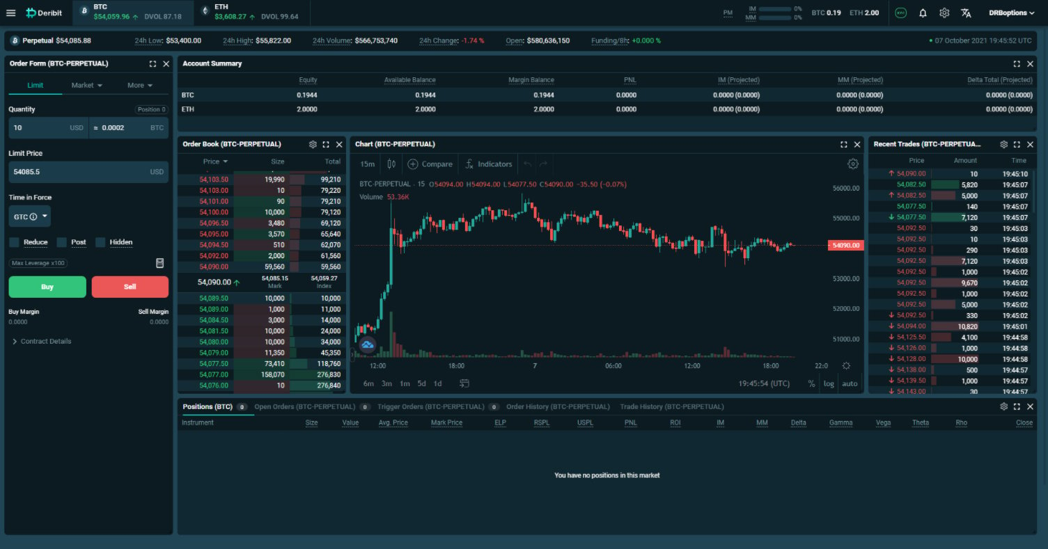
When you go to deribit.com and log in, you will arrive on the main trading page. With the exception of the menu system, the futures trading page is laid out very similarly to how the legacy UI was if you had the balances table enabled and the wide chart disabled.
Menus
First let’s take a quick look at where the navigation menus can be found. All menu items are now found at the top of the page. If we click the three line icon in the top left it will drop down links to many of the pages available on the website, including the new block trade page, and the swap page, where you can exchange your currency balances.
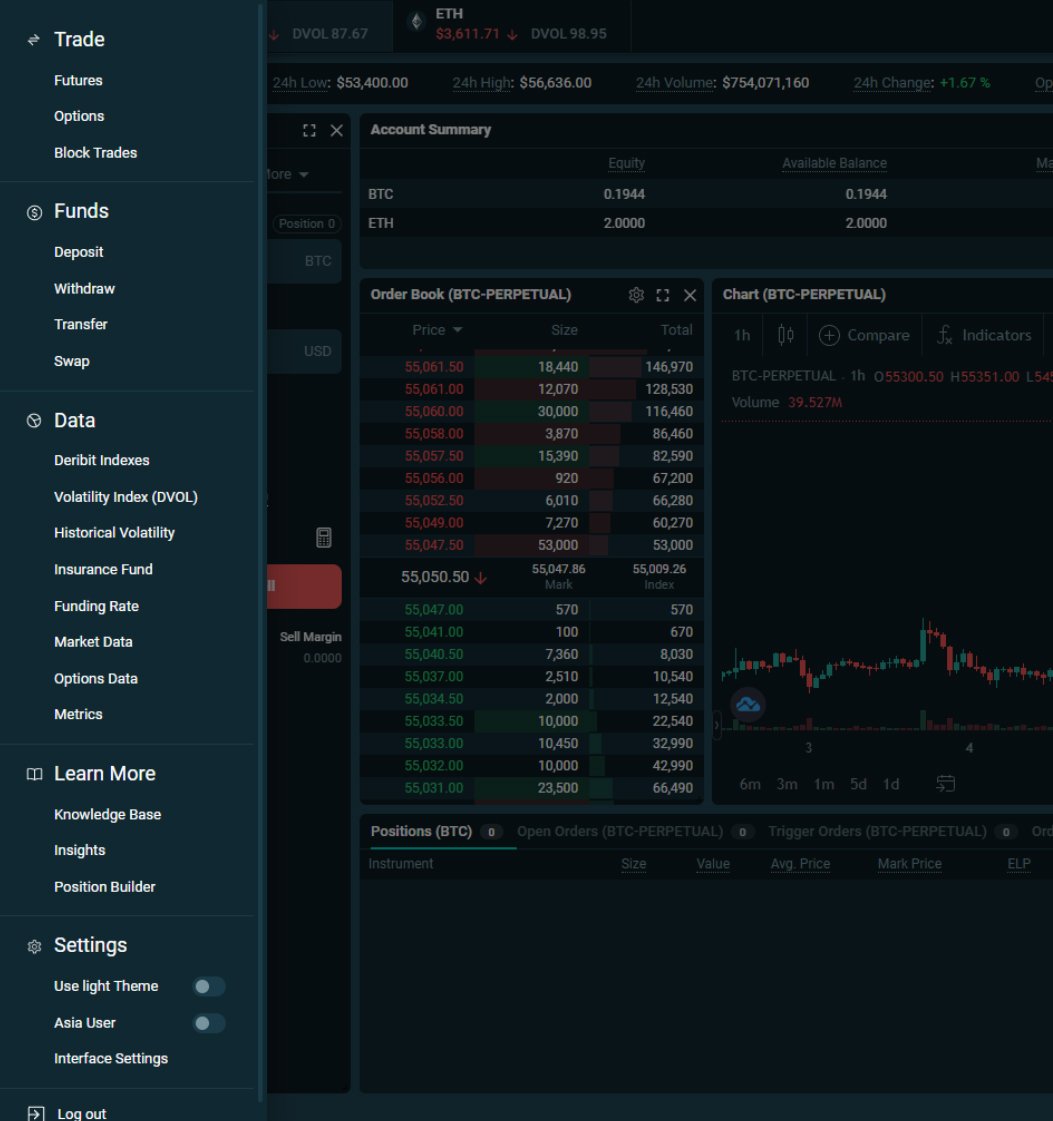
As these menu items no longer permanently take up space on the left side of the screen, this leaves more room to arrange the trading screen however you like.
To navigate to different trading pages, we now hover over the desired currency at the top, which will drop down a menu containing each of the available futures contracts, as well as a link to get to the options trading page.
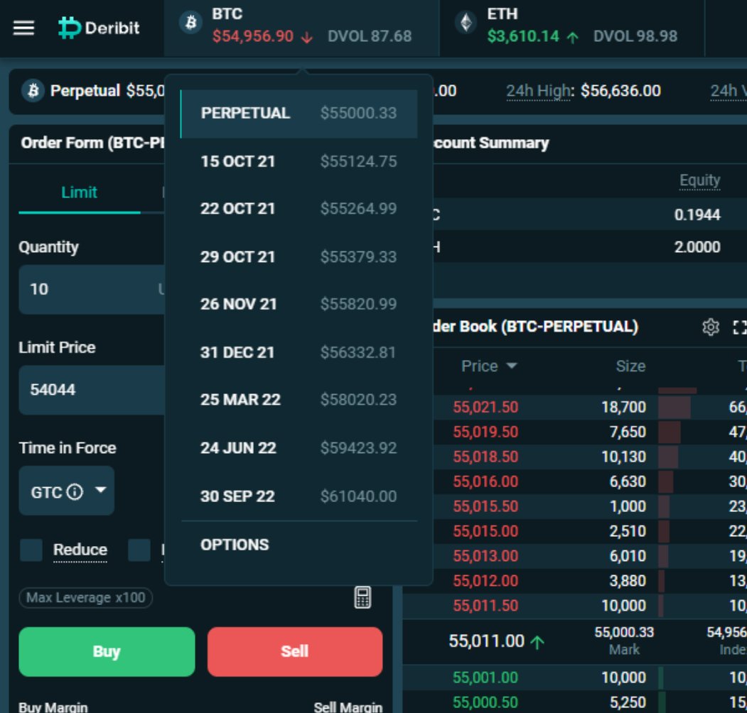
If we want the bitcoin instruments we hover over BTC, and if we want the ethereum instruments we hover over ETH.
Moving over the right side, we still have our margin usage and equity displayed. In this new UI though, we can see our equity for both currencies at once.
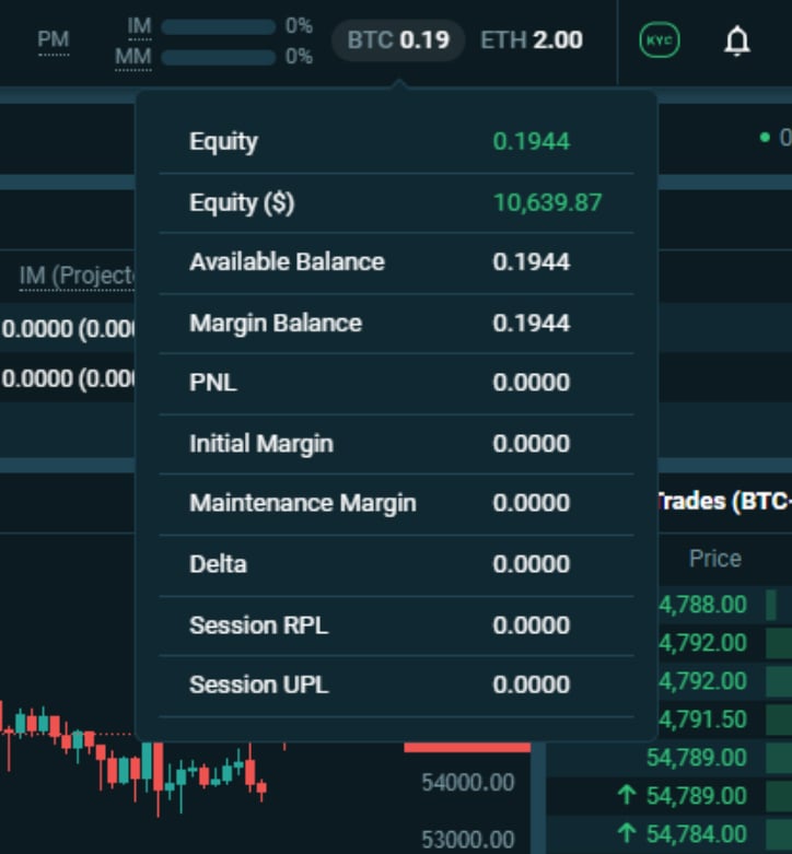
If we hover over these equities, we can also see several other statistics about our account for that currency.
The cog wheel settings is where we add new modules or restore the layout to the default. More on that shortly.
And finally in the top right we have the account menu, where we have links to several important account pages, such as the transaction log.
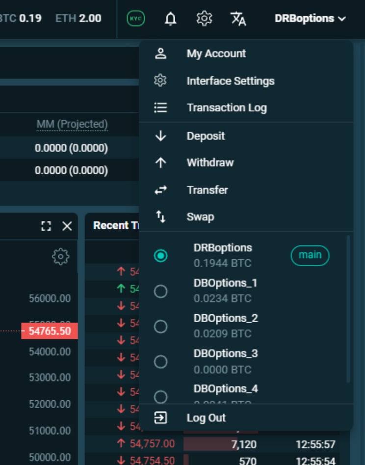
This menu is also where we can easily switch between subaccounts
Modular layout – the modules
One of the greatest improvements in the new UI is the ability to customise the size and location of all the modules, as well as which modules are displayed, including some brand new modules.
The layout is now fully modular so, with the exception of the top menus, we can move and resize each module we see on the page. To move a module, click and drag the top of the module.
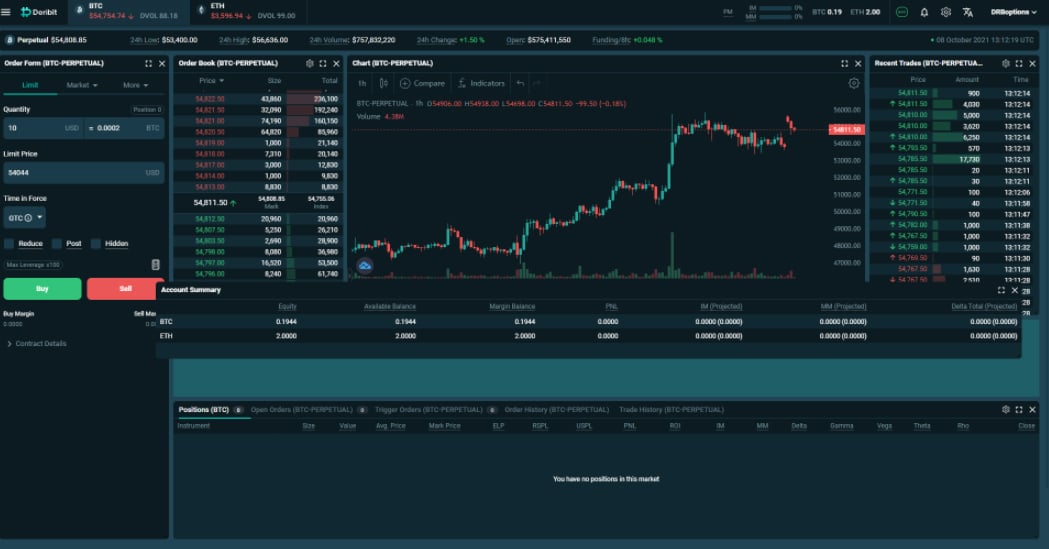
This allows us to drag the module wherever we like in the layout.
We can also resize the modules by clicking and dragging the bottom right corner of the module.
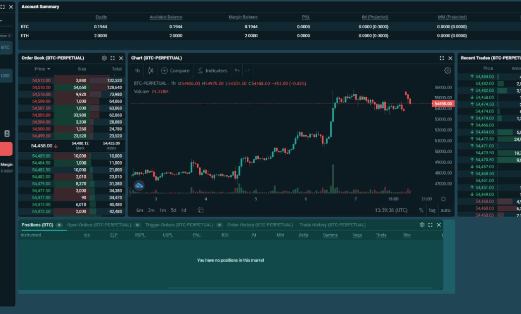
Here I’ll resize the position table at the bottom, then move it across to the right to make room for a new module. Now if I go to the cog wheel settings at the top, then click edit layout, there is a pop up with a drop down menu full of all the modules we can add to the page.
It’s possible to add any of these to the page, including the options modules, but for this example I’ll pick the new depth chart. If I resize and move this module it should fit neatly under the orderbook in the gap I just made by changing the size of the position table, like so.
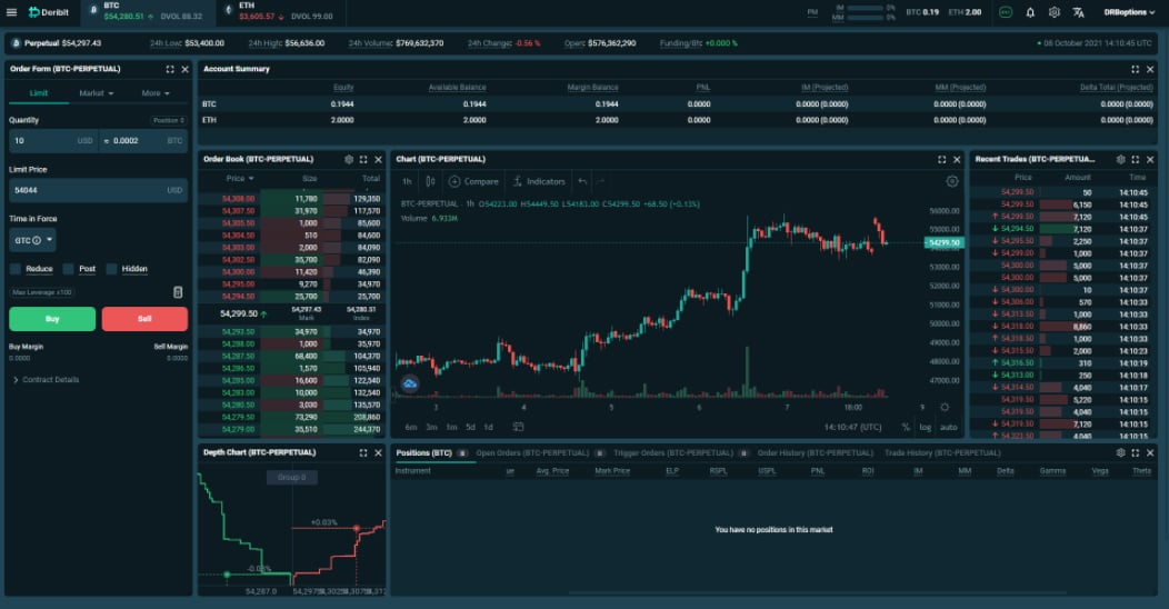
We can also change the grouping on the depth chart by clicking the group button in the center. Many of the modules have their own settings that can be adjusted to suit you. If we click the cog wheel settings for the recent trades module for example, we can edit the maximum range for the size bars in the amount column. This allows us to choose which size trades will stand out visually in the recent trades list.
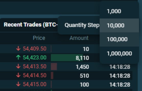
What if we want to see more of the position table still? We could shrink the order form and move everything across. Or we could resize the chart and place it under there for example.
If we later decide it’s not helping us and is just cluttering the screen, we can get rid of the depth chart module by clicking the cross in the top right. Then we can resize the chart to fill the space.
Column resizing
Another other useful customisation feature is the ability to adjust how the columns in any table modules are displayed. Using the Account Summary module as an example, the columns are currently in the default order and stretched to fit the full width of the module.

There are several ways we can edit how this module looks, and to access these settings, we just need to hover over the top of the columns, then click the three line icons.
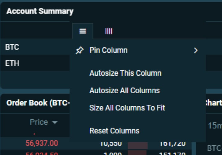
If instead of being stretched to fit, we want to reduce the whitespace between columns, we could do this by going to the menu for any column, and clicking autosize all columns.

This then cuts the unused spaces out, making the displayed data more compact.
After we click on any three line icon, there is also a second icon that appears just to the right. If we click this one we can add or remove columns. So let’s say we don’t want to see our margin requirements in this module, but we do want to see our realised and unrealised session profit. To do this we can just uncheck the IM and MM columns, and check the RPSL and UPSL columns to enable them.
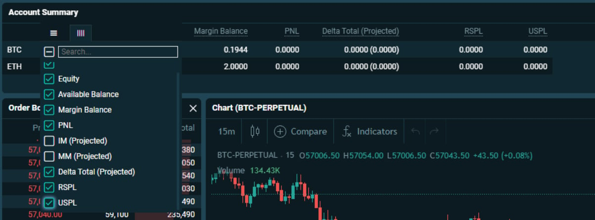
We can also pin columns to the left or right, and use this to rearrange the columns in our preferred order. Let’s say we want to keep the currency column as the first column on the left, but then we want the ‘Delta Total’ column to be next. To do this, we make sure the currency column is pinned to the left, and then we pin the delta column to the left as well.

This moves the delta column over as the second column in the table, and leaves us with the layout we wanted
With such customisation possible, it’s possible to design your trading screen in a way that compliments your own trading.
Options screen
Let’s take a look at how the options page looks in the new layout. To navigate to options, we can either go to the top left menu and then click options, or we can hover over the desired currency at the top, then click options.

When you first navigate to the option page you will be greeted with this screen.
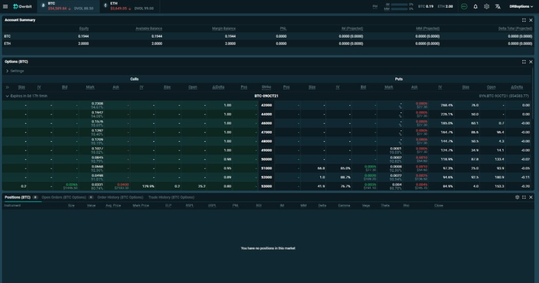
Before we make some edits, let’s do a quick walk around. Just as on the futures page we have an account summary module at the top.
Underneath this is the option chain module. This contains all the options for the chosen currency; in this case bitcoin. We can expand or collapse each expiry with the arrows on the left. We can also edit settings for this module at the top. This includes enabling/disabling columns that show different data, including the ability to show each of the greeks separately, as well as the ability to choose which strikes are shown.
We can double click any option to bring up the order form for that option, however we’ll improve this process with another module in a minute.
If we scroll down the page, we can see the positions table, and then the recent trades for both call and put options. Even though we are now on the options page, the positions table will still also show any futures positions we have on.

We can even get it to display both BTC and ETH positions by going into the cog wheel settings for this module. And it also has new columns to display the greeks for our positions as well.
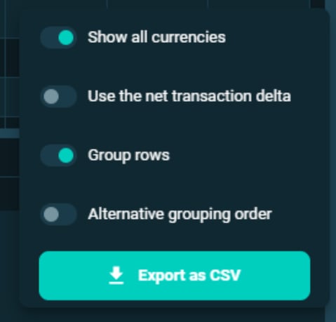
If you have many positions spread across several instruments and expiries, you may also want to use the new grouping settings.
Adding the option order form to the option screen
As we covered earlier you can double click the options to bring up a pop up with the order form for that option. With the new modular layout though, it’s possible to have the option order form as a module on the page at all times.
To do this we go up to the cog wheel settings at the top of the page, and click edit layout. Then we need to find the order form module, and click to add it to the page. We can also add the order book module, and then rearrange both however we like.
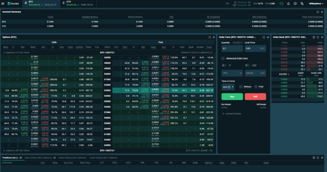
Once this is done, whenever we click on a different option in the option chain, the order form and order book will automatically update to show the data for the selected option. This allows option trading to take place while still being able to see the other elements of the screen.
Block trading page
One of the new functionalities built into the new UI, is block trading directly on the Deribit website. The block trading page can be found by going to the top left menu, and clicking on ‘Block Trades’.
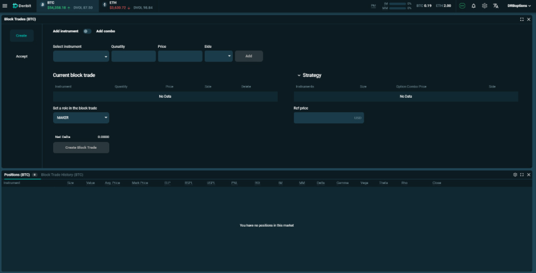
We won’t go over the specifics of how to use this page today, as that could take up a whole other lesson in itself. However, in short, this page allows two counterparties to trade directly with each other without having to worry about crossing on the public order books. They can set up a trade and agree a price in private, then execute it via a block trade.
Swap page
One other very useful new functionality is the ability to swap between currencies directly on Deribit. The swap page can be found by going to the top left menu, and then clicking on ‘Swap’. On this page it is possible to exchange BTC for ETH, or visa versa. So if you have some bitcoin in your account, and then decide you want to trade some ETH options, you no longer need to send that BTC to another exchange, then send ETH back to Deribit. This can be done in a matter of seconds on the swap page.
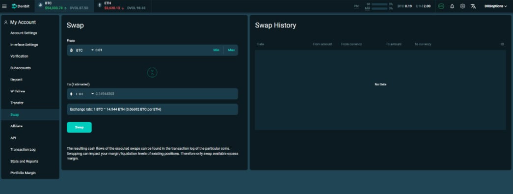
Just make sure the currency direction is the one you want, enter how much you would like to swap, and you will be shown an exchange rate including how much you are expected to receive. If you’re happy with everything, then just click ‘Swap’ and the swap will take place in your account.
Summary
As the new layout is extremely customisable you can now set up your Deribit screen to suit you and your trading.
If you like a minimalist screen with few distractions, you can remove any modules you don’t need. If you prefer having all the information possible at your fingertips you can add anything you want to the layout, including some of the new modules like the depth chart and option order form.
So experiment with the new layout until you find something that optimizes your Deribit trading experience.
Visit our new Interface here.
AUTHOR(S)
