
There is a new customisable version of the Deribit website user interface available. The long awaited third iteration, named UI Pro, allows you to choose which information is shown, as well as the size and position of each of the different modules.
Modular layout
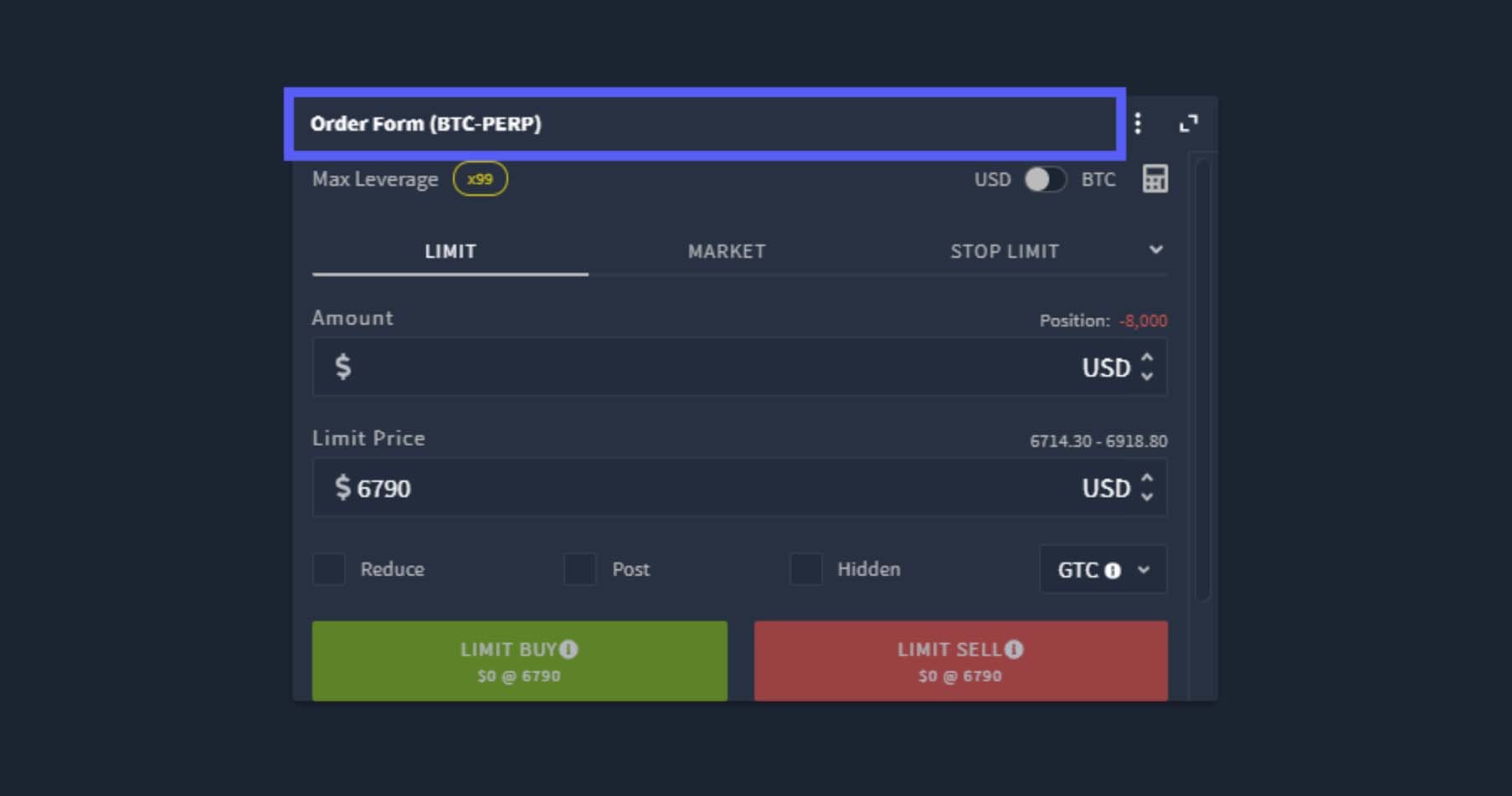
The first and most significant change you will notice about the new user interface is that it is now fully modular. With the exception of the top menu, all modules can be customised for both size and location.
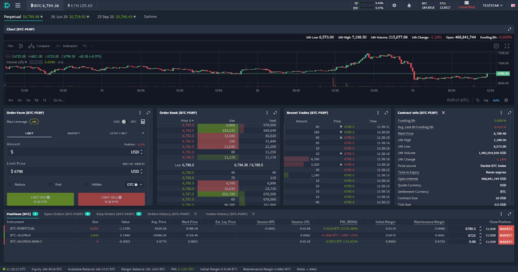
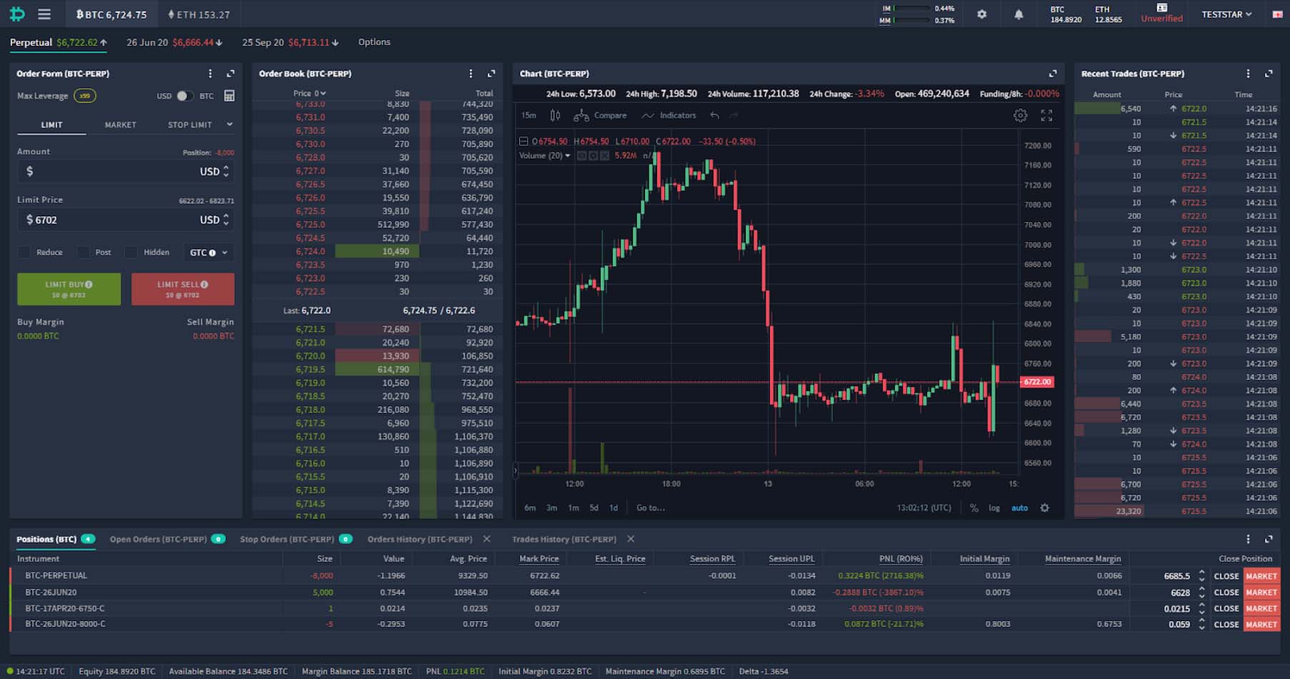
When you first load the page you’ll be greeted with something like this:
The position of the module in the layout can be changed by clicking and dragging the top of the module.
When you do so, the teal highlight box will show you where the module will be placed once you let go. You can also use this dragging and dropping process to create new columns or rows.
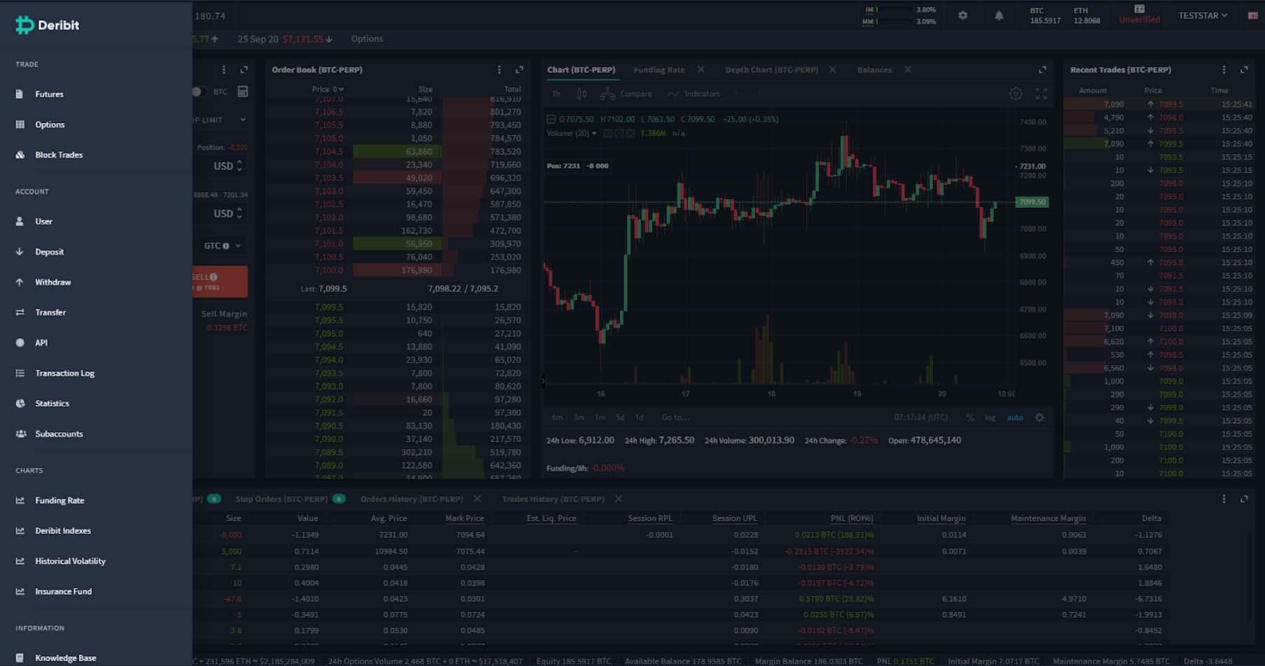
Let’s demonstrate how we can move and resize these modules by redesigning our new layout to look like the previous version. So we’ll bring the ‘Order Form’, ‘OrderBook’ and ‘Recent Trades’ modules up into the same row as the ‘Chart’ module. This will give us something like this:
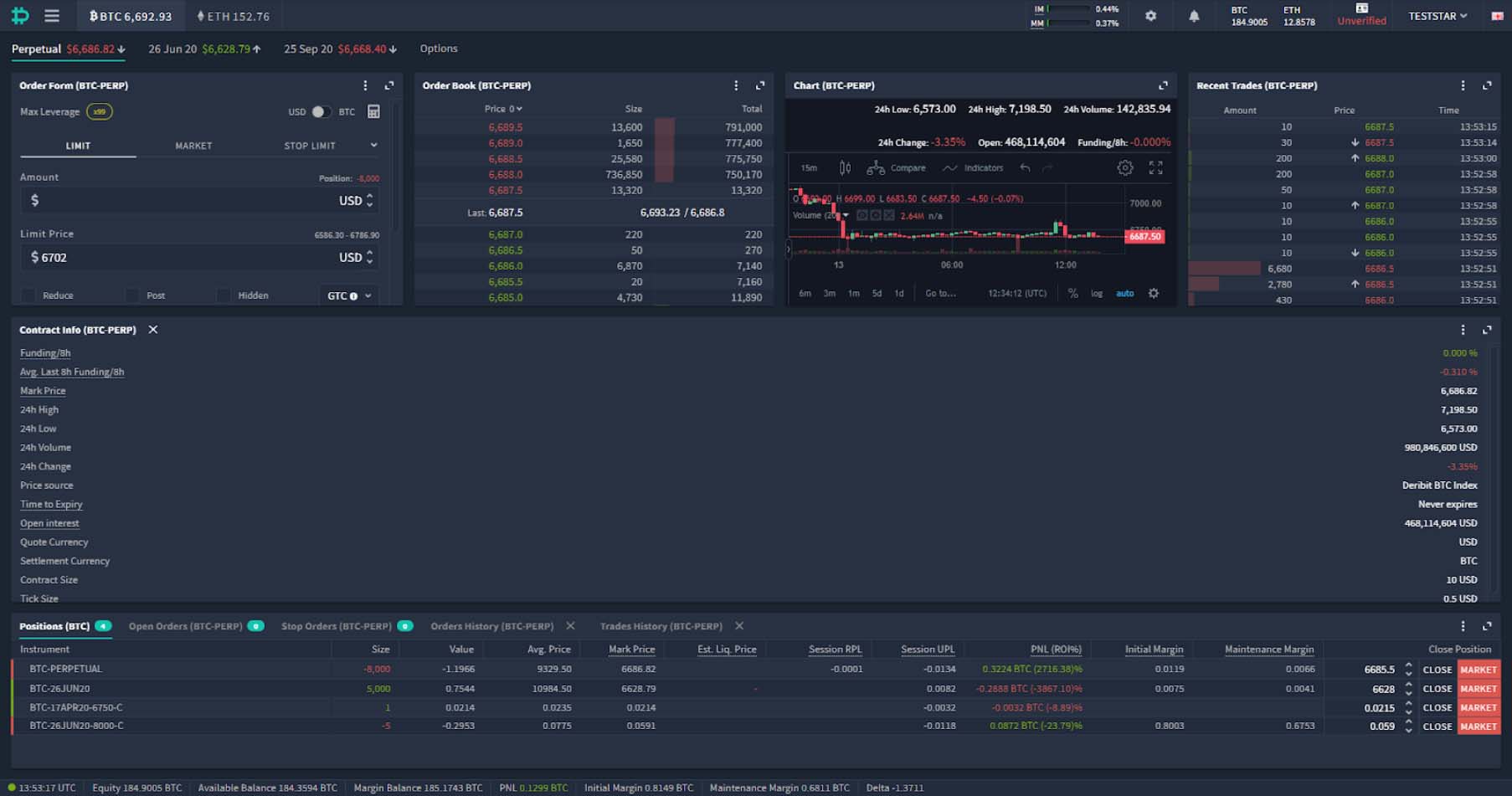
Next we’ll delete the ‘Contract Info’ module. To do this click the little cross next to the module title. This gives us something very close to the previous layout.
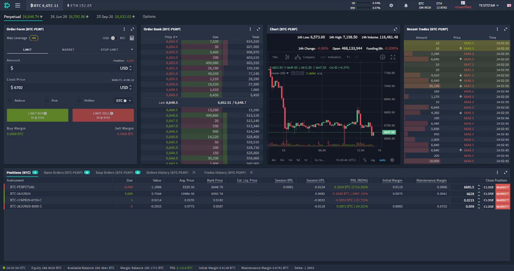
Then we can resize the columns and rows to suit our needs and screen. To do this click the space between the modules and drag to resize. For example, on this screen setup (1080p) we can easily make the top row larger, giving us more room to see all the information. And we can resize each of the modules in the top row, making the ones with wasted space narrower, and giving us more room to display the chart more prominently, like so:
Adding a module
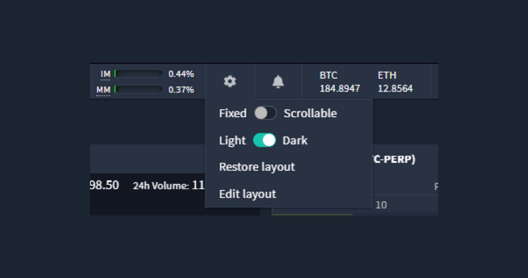
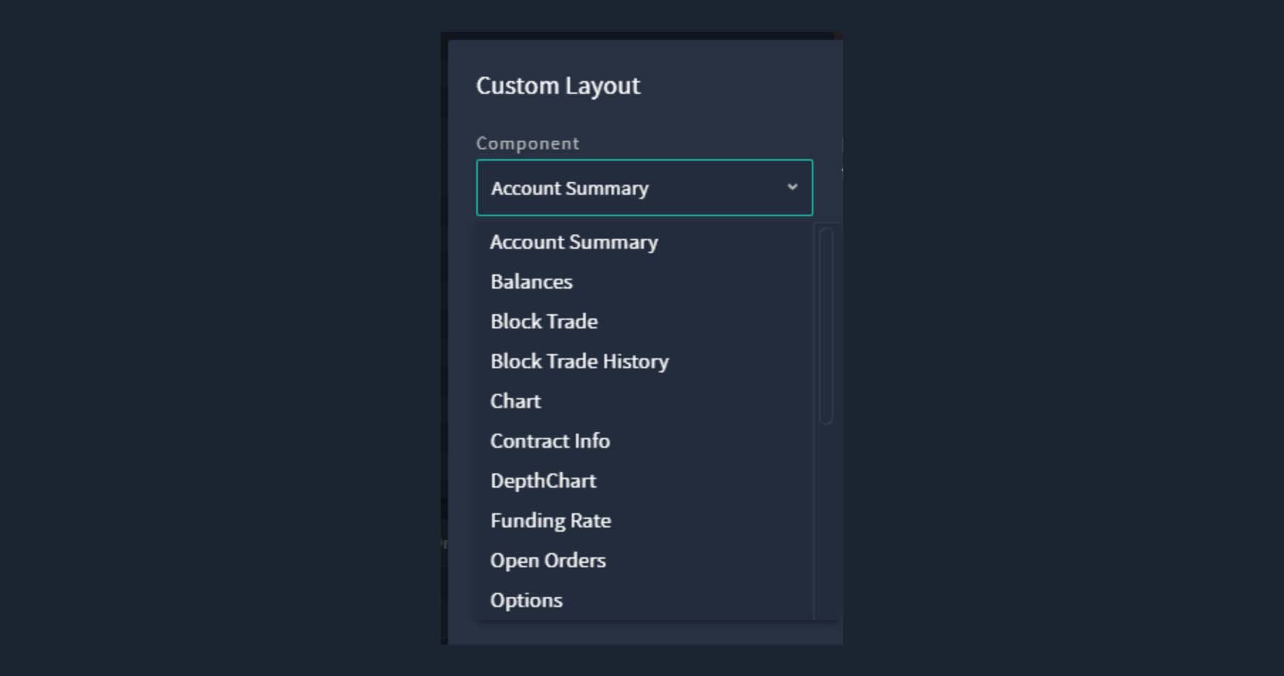
Don’t worry about where the ‘Contract Info’ module disappeared to, it’s easy to add any modules onto the layout, including ones you’ve previously removed. Simply click the cog icon at the top of the page, then click ‘Edit layout’.
You’ll then have a drop down menu from which to select the module you wish to add to the layout.
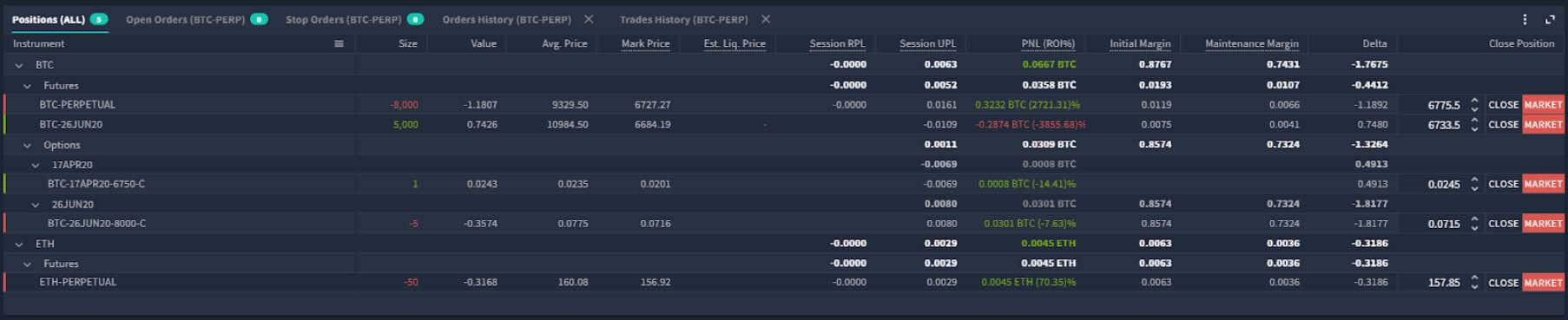
As well as being able to move and resize each module, it’s also possible to stack several modules into the same place. This results in there being several tabs at the top of the module that can be used to select which one is visible, as can be seen in the ‘Positions’ module at the bottom. By default this module will show:
- Positions
- Open Orders
- Stop Orders
- Orders History
- Trades History
This stacking can be used on any of the modules, for example here we’ve stacked the ‘Funding Rate’ module onto the ‘Chart’ module. You can stack additional modules by pulling one header into another. A small vertical line will appear when it’s ready to be dropped.

Depth charts
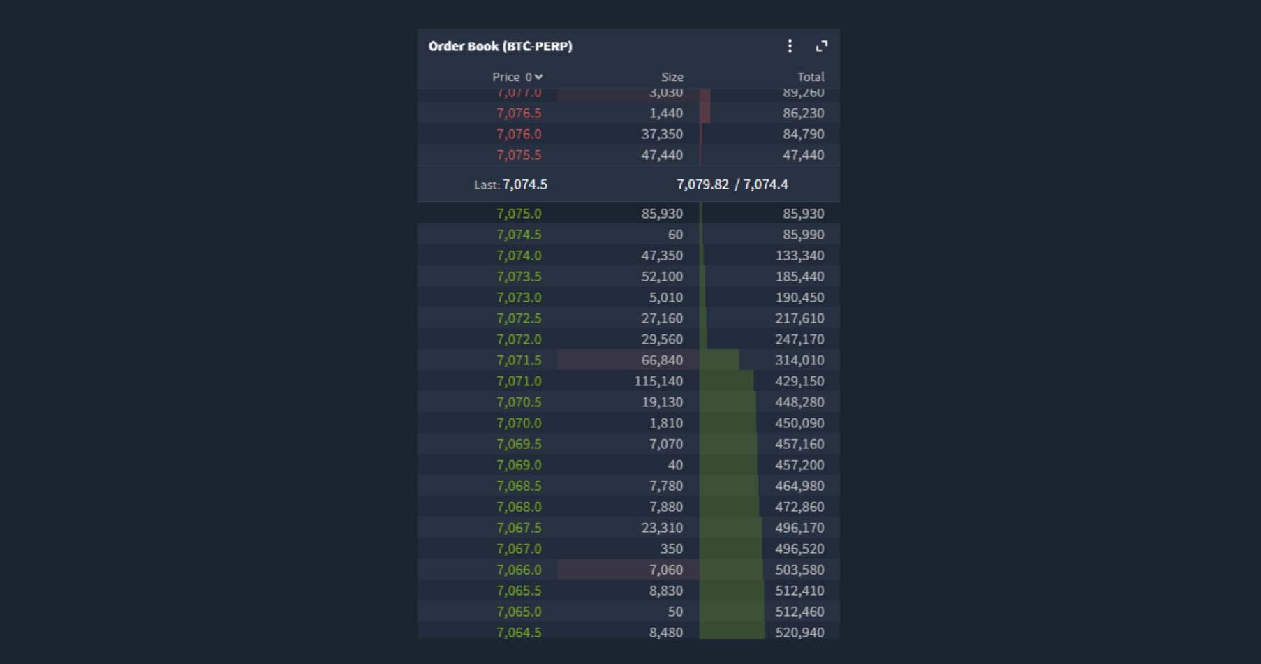
You may have already noticed that in the ‘Order Book’ and ‘Recent Trades’ modules, there is now a depth bar. These are a graphical representation of how large a particular entry is. The larger the entry, the larger the bar will be.
There is also a new ‘Depth Chart’ module which can be added wherever you like in your layout. Here we’ve stacked it onto the ‘Chart’ and ‘Funding Rate’ modules.

You can change the grouping by clicking the ‘Group’ button at the top. This gives a useful visual of the order book.
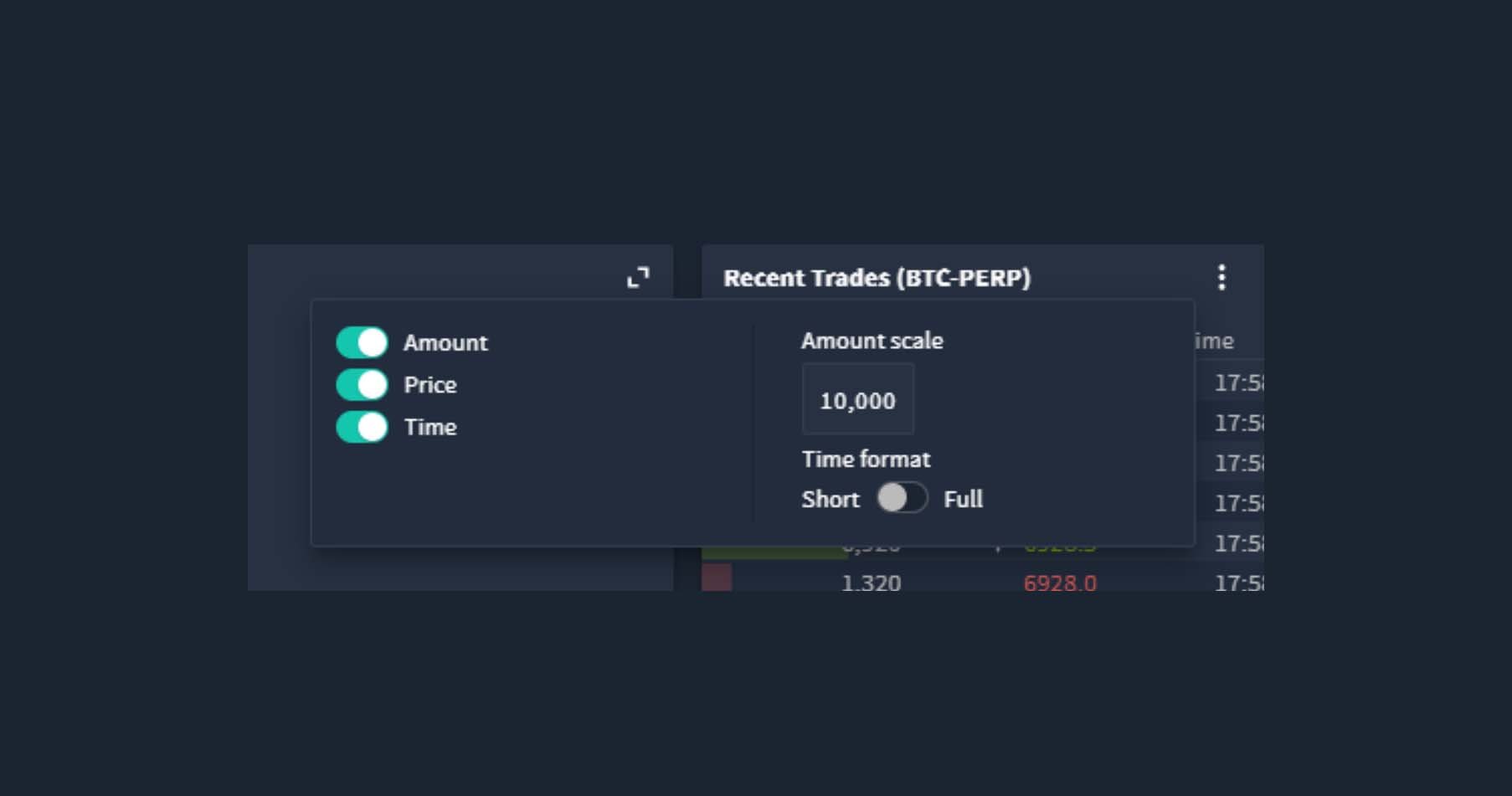
The scale of the depth bar in the ‘Recent Trades’ module can also be calibrated. To do so click on the three dots icon in the top right, then click the number, which will cycle through the available options.
Recent trades changes
While we’re looking at recent trades, let’s look at how trade direction and last tick direction are displayed in the new user interface.
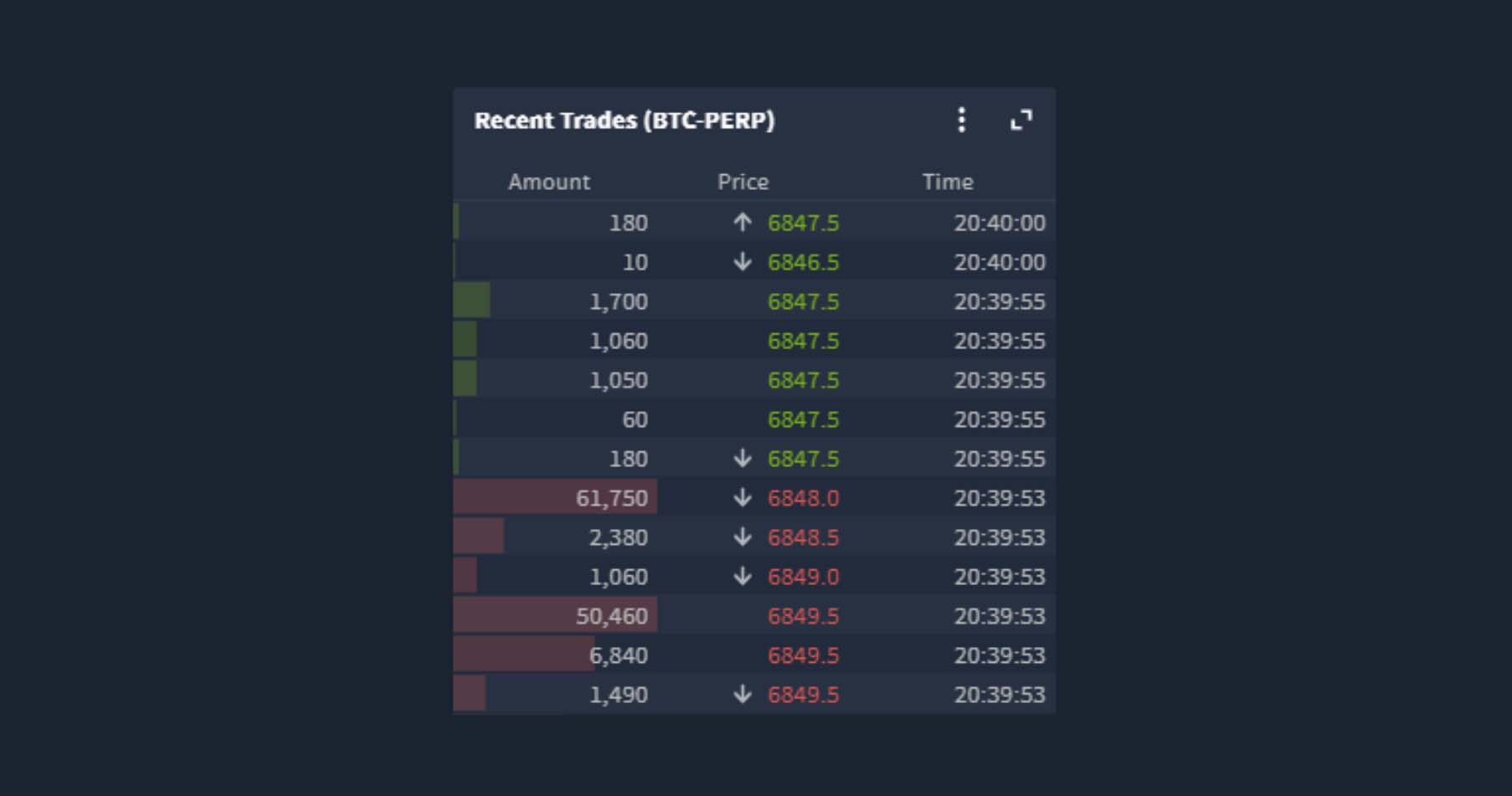
The direction of the taker side of the trade is represented by colour. When the taker order is a buy, the depth bar and the price are both coloured green. When the taker order is a sell, the depth bar and the price are both coloured red.
When a trade has moved the price, the direction of the move is now represented by an arrow next to the price. An up arrow for an increase in price, a down arrow for a decrease in price, and when the executed price is the same as the previous trade there is no arrow.
Module settings
The ‘Recent Trades’ module is not the only one that has customisation options. You can find the three dots icon in the top right of many of the modules. Click this, and any settings that can be customised will be displayed.
Many of these options are brand new additions to the user interface, so let’s go through a few of them next.
Futures order form
It is now possible to enable some single click quantity buttons on the futures order form. This enables you to quickly adjust order sizes and prices without having to type the order in.

For example, to enter an amount of $5,000, simply click the ‘+1000’ button five times.
Order book
The order book has a new setting that allows you to choose whether the module is fixed or scrollable. When scrollable is selected, you can use your mouse wheel to scroll up and down to see much deeper into the order book. Combined with the new depth bars this allows you to see very quickly where any large orders are sitting.
Fixed/scrollable layout
This fixed or scrollable setting is also available for the entire page. To access this click the cog icon in the top menu.
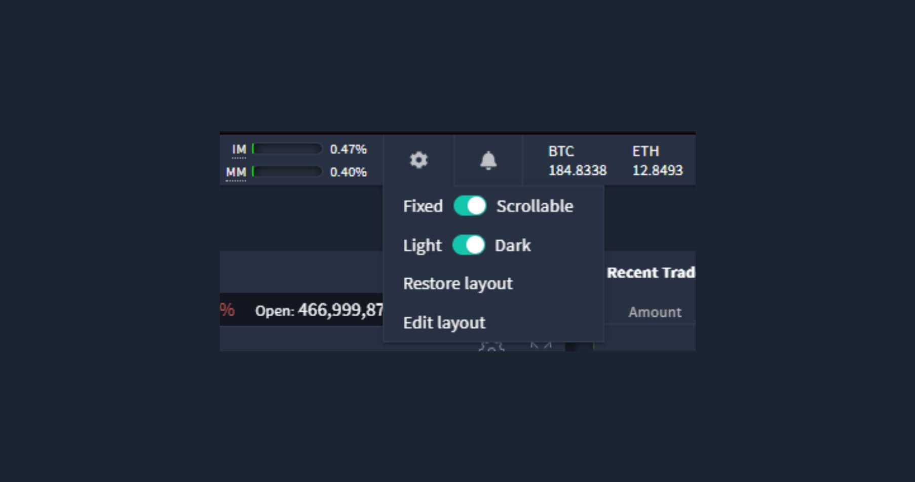
By default this is set to fixed, meaning the layout will autofit to the browser window size. If however you wish to design a larger scrollable layout, you can change this setting to scrollable and you will then be able to do so.
Positions, orders and history settings
As we touched on earlier, the positions, orders and history modules are stacked together by default, and they also have similar settings.
Positions, orders and history modules now show futures and options together so you can see your entire portfolio at once, even across multiple currencies.
As the settings are similar we won’t waste too much time going over each one separately, but let’s take a look at the settings for the ‘Positions’ module as an example. As usual, click the three dots icon and the settings will pop up like so:

Each of the possible columns for the table can be seen on the left here. If you want to see the deltas in the table, simply enable it in the settings. If you don’t want the close buttons in the table and they’re taking up valuable space, no problem, just disable this in the settings and they will disappear.
On the right hand side of the settings pop up, are any additional settings. For example, in the ‘Positions’ module settings you have the ability to:
- Show all currencies – when enabled, will show both ETH and BTC positions
- Use net transaction delta – option positions will take account of the premium paid/received
- Group rows – will group the rows in the table by currency, instrument type and expiry, like so:
- Export as CSV – will download a csv file containing the data displayed in the table
Column settings
With the ability to change which statistics are shown in these tables, it’s also useful to have some additional settings to assist in arranging the columns.
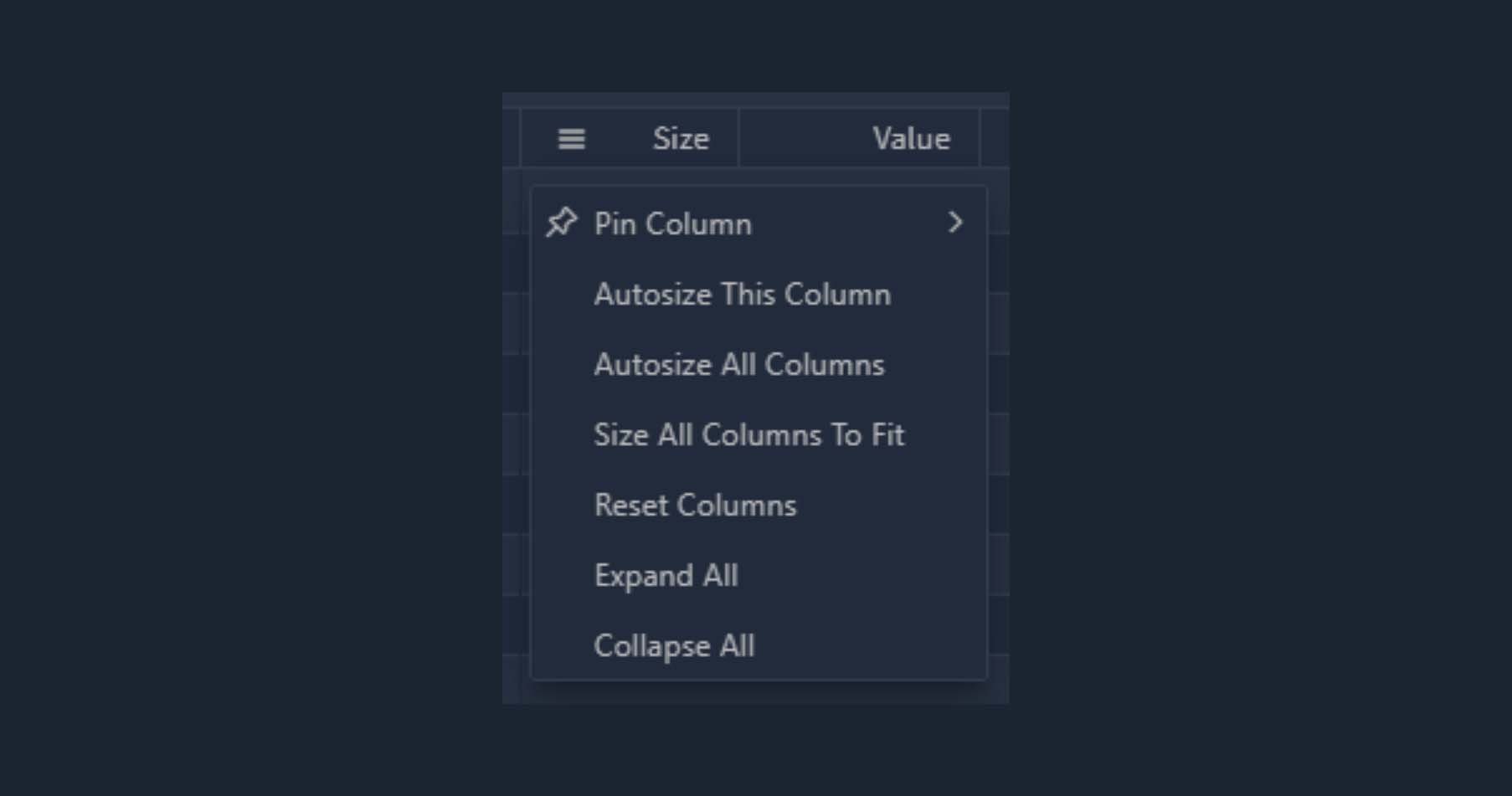
With these settings it’s possible to:
- Pin specific columns to the left or right
- Autosize individual or all columns based on the data contained within them
- Reset the columns
- Expand or collapse all rows (when ‘Group rows’ is enabled in the module settings)
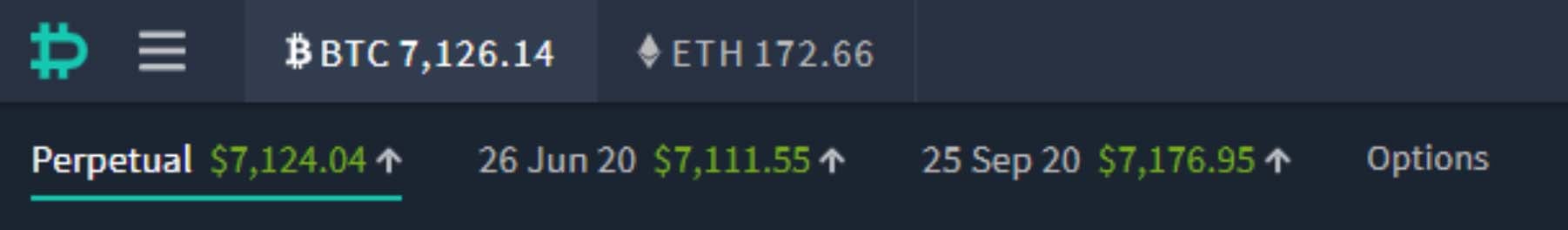
Selecting currency and instrument
In the top left you can see in the first row the different currencies available (BTC and ETH). Clicking either one will allow you to select the instruments for that currency on the next row below. On this next row you can select the perpetual futures, any dated futures, and options.
Clicking any of the futures contracts, including the perpetual, will simply change which instrument is displayed in the current layout. Clicking ‘Options’ though, will take you to a separate options layout. Though it’s worth noting that the option modules can actually be added to the futures page and vice versa if you prefer to see everything on one page.
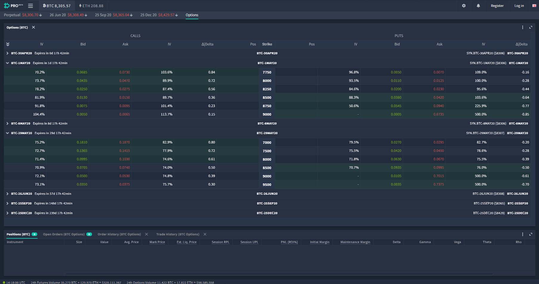
The option screen
For now, let’s take a look at the separate options page by clicking ‘Options’ in this top menu. When you first click this you’ll be greeted by this option layout:
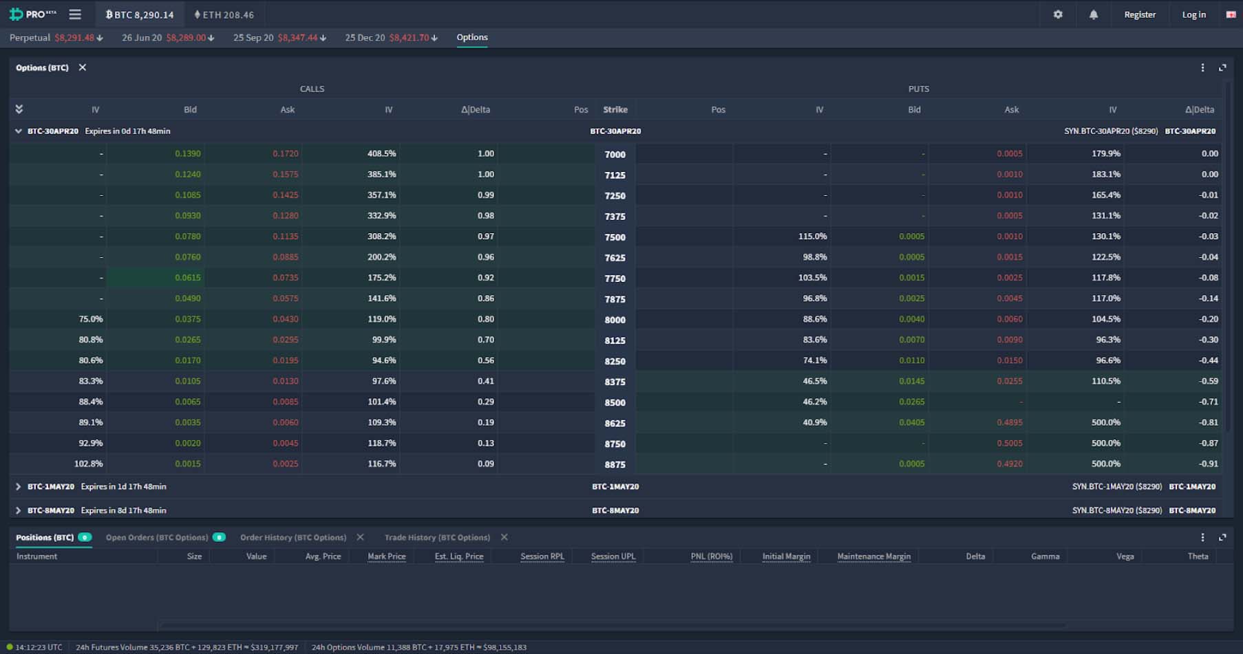
With the entire option chain in one module at the top, and then similar to the futures screen the following modules stacked underneath:
- Positions
- Open Orders
- Order History
- Trade History
As with most modules the option chain module has a few settings that can be accessed by clicking the three dot icon in the top right.
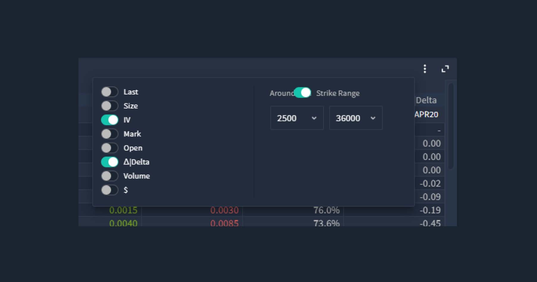
On the left hand side, you can choose which statistics are shown for each option. One very useful column to add is the ‘Mark’ column. This displays the current mark price of the option. You may also wish to display the $ prices as well for easy reference.
On the right hand side there is a setting which allows you to choose which strikes are being shown. You can choose to do this via a dollar range of strike prices, for example choosing 2500 and 36000 will display every available strike price from $2,500 up to $36,000.
Or if you prefer you can choose a certain number of strikes to be shown either side of where the current price is. To do this toggle the setting to ‘Around ATM’ and then enter how many strikes either side you would like to display. This is particularly useful if you only ever trade strike prices that are close to the money.
Expand/collapse buttons
By default all the expiry dates are expanded, but by utilising the arrow icon in the upper left of the option chain, and the icons on each individual expiry, you can select which expiries are visible. Like so:
Option chain visuals
There are a couple of notable visuals on the option chain. Firstly, strike prices that are currently in the money are displayed with a green background so they stand out.
And secondly, when the best bid or ask is above or below the current mark price respectively, it is highlighted with a teal border. Previously this was displayed as a change in colour of the IV percentage underneath the mark price.

Option order form
To open the option order form, click on any option row twice. The first click will select the option, which is useful if you have a chart, depth chart, contract info or likewise in your layout and can review the option at a glance. The second click will bring up the form like so:
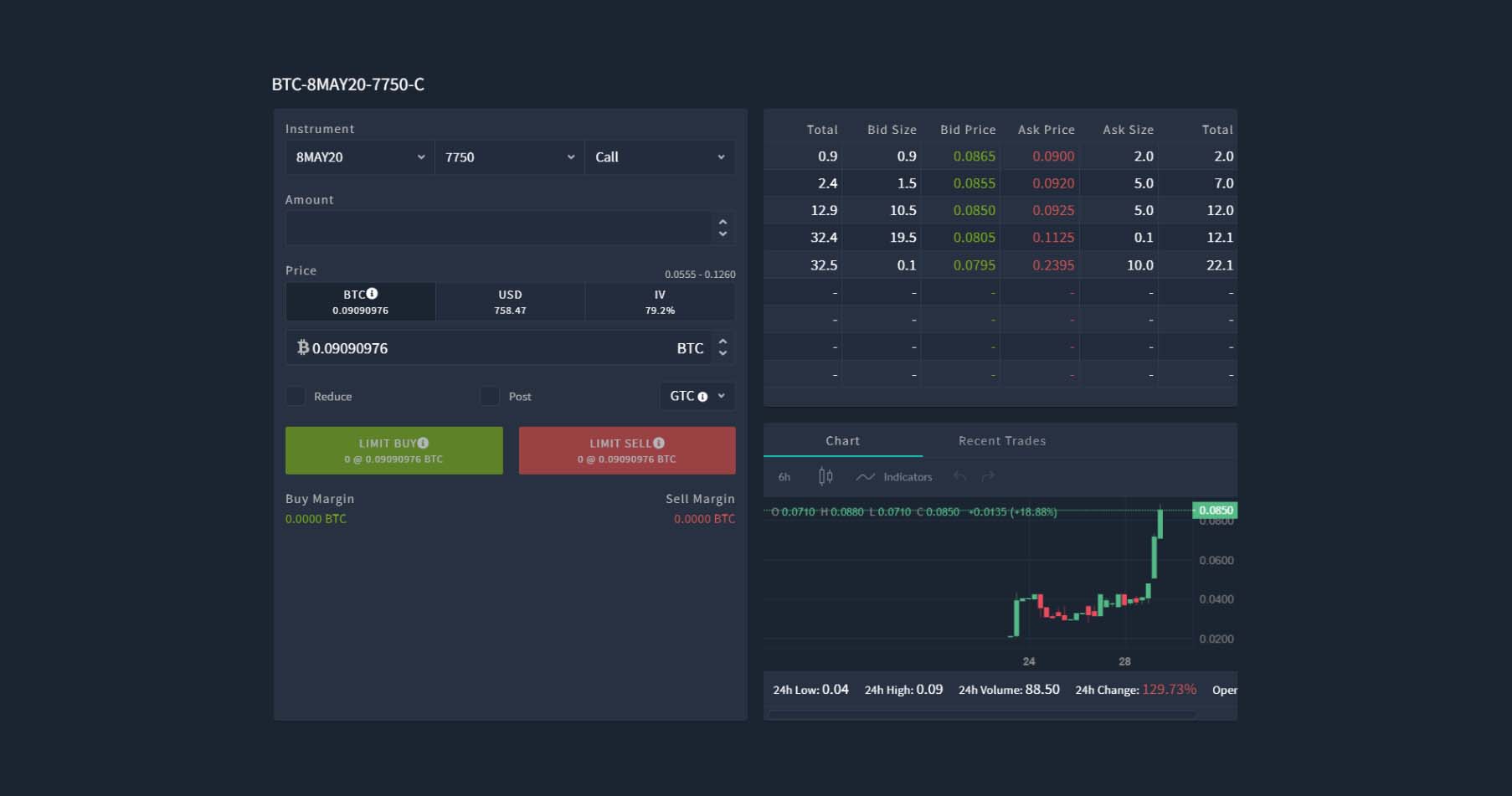
The option that is displayed will be the one you clicked on to open the form, however the option you’re looking at can be changed easily using the drop down menus in the top left.
As before you can place option orders priced in BTC, or auto adjusted prices to match a certain USD or IV level. The USD and IV orders are now available by default without having to enable them.
The charts displaying the option price over time have been upgraded from a basic line chart to a fully functional candle chart. You can adjust the interval, candle type, and even add indicators.
Left menu
The top right menu is largely the same as it was in the previous version of the layout, however the previous left hand navigation menu is now collapsed into the three line icon in the top left. This saves space, enabling more freedom in design in the layout itself.
Click the menu icon and the left menu will pop out. From here you can navigate across the entire site.
You can navigate to:
- Each of the different trading screens. There is a new addition of block trades here which we will cover in a separate lesson.
- The account pages such as deposits, withdrawals and subaccounts.
- Various charts such as the index and historical volatility.
- The knowledge base which contains information about the website and instruments.
- The Deribit Blog, which contains a wealth of information on Deribit itself, trading in general, and the wider cryptocurrency market.
- And you also have some website settings including whether or not animations are shown in the layout.
Summary
As the new layout is extremely customisable you can now set up your Deribit screen to suit you and your trading.
If you prefer a minimalist screen with few distractions, you can remove any modules you don’t need. If you prefer having all the information possible at your fingertips you can add anything you want to the layout, including some of the new modules like the depth chart and funding chart.
And if you don’t quite have the screen real estate to fit everything you want in, you can even stack modules on top of each other, make the entire layout scrollable, or stretch the layout over multiple monitors.
So we invite you to experiment with the new layout until you find something that optimizes your Deribit trading experience.
Try UI Pro BETA
AUTHOR(S)
Deribit Content - Spreadsheets, Options, Futures Premiums..
Deribit CM & Educator • Youtuber • Inquiries: [email protected]