

Annual analysis and what 2024 may bring, by BlockScholes.
Subjects:
> Summary
> All-Time Lows
> The ETF Risk Premium
> ETH Vol Under-Performed
> Different Inflation Paths
> Deceptive Growth Resilience
> Pivoting from the Pivot
> Historical Hints for the Outlook
Summary
Crypto-asset volatility reached all-time lows this summer as lingering damage to confidence from the FTX collapse saw trade volumes trend lower. It was not until August that we saw an end to the downward reaching trend and volumes and volatility began to recover.
The second half of the year was dominated by spot BTC ETF applications and macroeconomic uncertainty. The event risk premium demanded for expiries later than the second week of January grew alongside expectations of approval by the SEC. This caused an unusual kink in the term structure of ETH’s as well as BTC’s at-the-money volatility that moved across tenors as the event date drew closer.
The repricing of bets on the path of monetary policy followed the developing communications from the Federal Reserve. While first repeating the “higher-for- longer” rhetoric that saw markets price for one more hike in 2023, the Federal Reserve pivoted swiftly to discussions of rate cuts in 2024.
The year ahead will be the year of volatility. While the latest economic data do show signs that inflation is moderating, employment remains strong, and growth is resilient, market pricing is certainly tilted towards the probability of a successful soft-landing. The building expectations mean that any deviation from the best-case scenario path could see considerable corrections in the year to come, with heightened sensitivity in risk-on assets to macroeconomic data releases.
All-Time Lows
Crypto-assets in 2023, led by major crypto-assets BTC and ETH, recorded all-time low levels of realised volatility. Despite reporting year-end returns of 150% (in BTC’s case), spot prices moved often sideways with little volatility for extended periods of time. At the same time, we saw trade volumes fall drastically much lower as a result of waning retail interest following the FTX crash in November 2022. We had previously commented on the close relationship between the two, with volatility tracking spot trade volumes (shown for BTC in the chart below, with a similar tale for ETH).
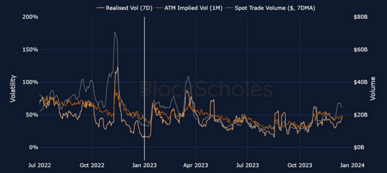
Figure 1 BTC 7-day rolling realised volatility (light orange), 1M-tenor ATM implied volatility (dark orange), and a 7- day moving average of spot trade volumes in dollars (grey) since July 2022. Source: BlockScholes
Beginning in Summer, both trends reversed course with the emergence of the spot ETF narrative. However, volatility levels today remain far below the high that we have come to expect from crypto- assets. So too are spot trade volumes below 2022 levels, having only begun to reverse their lacklustre trend in the last quarter of the year. This new trend looks set to continue into the new year, with an explosion in trade volumes widely anticipated by the market as a result of the ETF approval date in mid- January.
The previous peak in trade volumes (recorded in 2021) was driven by retail interest in an incredible run to all-time high price levels. The nature of this cycle feels different, however, as we expect the introduction of a spot ETF to be both a catalyst for access to and an indicator of renewed institutional interest in the asset class. We are interested in monitoring how institutional trade flow will impact the size and nature of retail flows, and whether regulated centralised exchanges will steal significant market share from incumbent venues.
The ETF Risk Premium
While implied volatility has tracked realised volatility levels closely throughout the last year, rising on the back of increased delivered volatility and falling in extended periods of market calm, both remain at far lower levels than we have come to expect from crypto assets. It is not clear if this marks a regime shift and that the recent lower levels of volatility are a hallmark of a maturing asset class.
We have seen other indicators of this too, such as an expedited resolution of dislocations in volatility markets, a trend which we would expect to continue given increased institutional participation in markets. While volatility expectations have tracked realised volatility well, we have also seen the market assign a healthy premium to optionality. This has reflected a desire for compensation for taking on the risk that volatility surprises to the upside.
At the beginning of the year, volatility expectations remained at extremely elevated levels despite no continuation of the volatility caused by the FTX fallout in early November. The high premium assigned to volatility partially reflected the lingering fear of further contagion throughout the crypto-asset market, which we had seen occur in each crisis in 2022, and the jubilant re-rally back to the $20K level that had been lost in the same event.
As spot prices stabilised at their recovered levels, the ratio of implied to realised volatility trended from above to below 1 for several months as realised volatility levels trended downward to reach their all- time lows and market price-implied volatility expectations followed. It was not until the emergence of the ETF narrative from the announcement of BlackRock’s application that the trend was reversed and, with it, the premium assigned to optionality began to rise across the term structure.
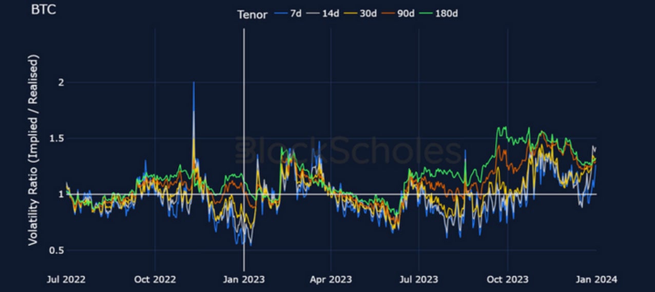
Figure 2 Ratio of BTC ATM implied volatility at each tenor to the underlying’s realised volatility (measured using a rolling 90-day long lookback window) since July 2022. Source: BlockScholes
In the latter part of the year, we saw volatility expectations contend mostly with the developing ETF narrative. Options markets first saw increased demand for volatility, which was soon followed by a volatile rally up towards $45K and $2.3K spot levels for BTC and ETH respectively. As prices settled once again at their new levels, implied volatility remained elevated above its Summer levels.
The focus on the mid-January date was clearest in volatility markets. Beginning in November, we observed a premium assigned volatility at tenors on or after the end-of-Jan expiry that resulted in a noticeable kink in the term structure of ATM implied volatility. The kink moved along the term structure as the date drew closer, and now sits between the 1-week and 2-week tenor point. Note that ETH’s volatility ratio followed a near-identical path throughout 2023 as BTC’s did and that its conclusions are similar. This includes the ETF-inspired volatility term structure kink, for much of November and December. However, ETH’s kink has now mostly been resolved.
ETH Vol Under-Performed
While the volatility levels of both major assets drifted lower, we also saw ETH’s volatility fall relative to that of BTC. Despite the strong correlation between the spot prices of the two assets (rarely below 80% since ETH was first listed on exchanges in 2017), historically ETH has moved with significantly higher volatility than BTC. This has meant that it rallied harder and sold off stronger than BTC.
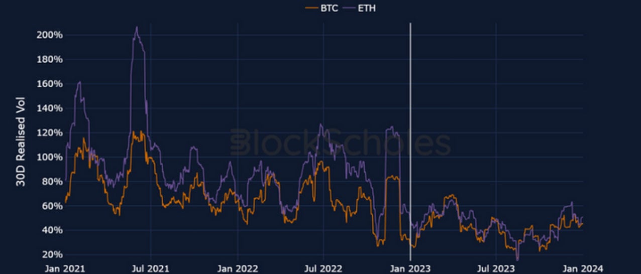
Figure 3 Realised volatility (measured using a rolling 30-day long lookback window) for BTC (orange) and ETH (purple) since July 2022. Source: BlockScholes
Since the Merge in September 2022, however, the volatility ratio between the two has been trending closer to 1 as ETH’s volatility has fallen closer to BTC’s levels. We cannot attribute BTC’s out- performance in volatility solely to the ETF news as it did not dominate discussions until the middle of the year, and it is possible that ETH markets have undergone a structural change as a result of its switch to Proof of Stake. The downward trending ratio of ETH to BTC volatility rebounded in November when ETH volatility spiked, and we saw similar behaviour in the chart of implied vol that shows the same rebound at the end of 2023.
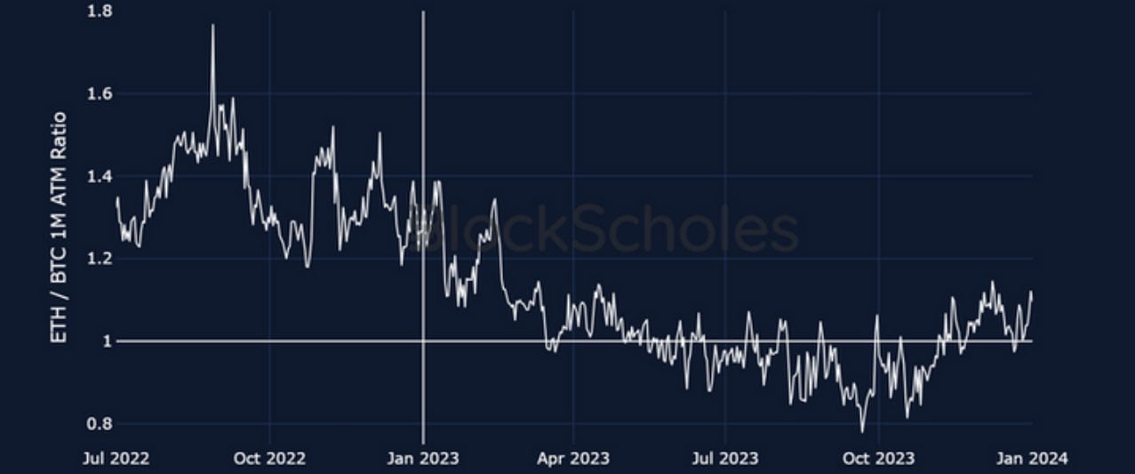
Figure 4 Ratio of ETH’s to BTC’s 1M-tenor ATM implied volatility since July 2022. Source: BlockScholes
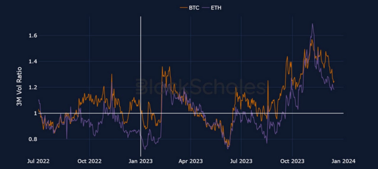
Figure 5 Ratio of 3M-tenor ATM implied volatility to 90-day realised volatility (measured using a rolling 90-day long lookback window) for both BTC (orange) and ETH (purple) since July 2022. Source: BlockScholes
Despite diverging on the level of realised volatility, we have observed similar levels of volatility premium in both assets throughout the last year. This means that markets are demanding similar premia for the risk that either asset explodes in volatility, despite the overwhelming chance that a BTC spot ETF is approved ahead of an ETH spot ETF. We would initially expect the approval of a BTC spot ETF (while positive for all crypto-assets as an asset class) to see out-performance in BTC against other coins in spot – a phenomenon whose beginning we can trace to as early as the Merge. One possibility is that the market sees the approval as priced in already, and expects a rotation of capital to other crypto-assets in a potential sell-the-news scenario.
We expect the resurgent trend in volatility to continue to rise, particularly in the short term. The approval of a spot BTC ETF is priced in as a near certainty by the market, and expectations are strong for a repeat of Bitcoin’s halving cycle performance. Any deviation from the bullish case is set up for strong repricing. Finally, we do not see crypto eschewing its sensitivity to macro-economic factors in 2023. Any unwelcome news of lingering inflation may call the likelihood of a soft landing into question, and we expect all risk-on assets to be impacted as a result.
Different Inflation Paths
Inflation rose consistently across advanced economies in late 2020, following a perfect storm of shifting supply and demand dynamics and programmes of potent fiscal stimulus following the pandemic. The simultaneous rise in inflation to similar levels across regions with similar pandemic responses suggests that the combination of lockdowns and fiscal stimulus was a common spark.
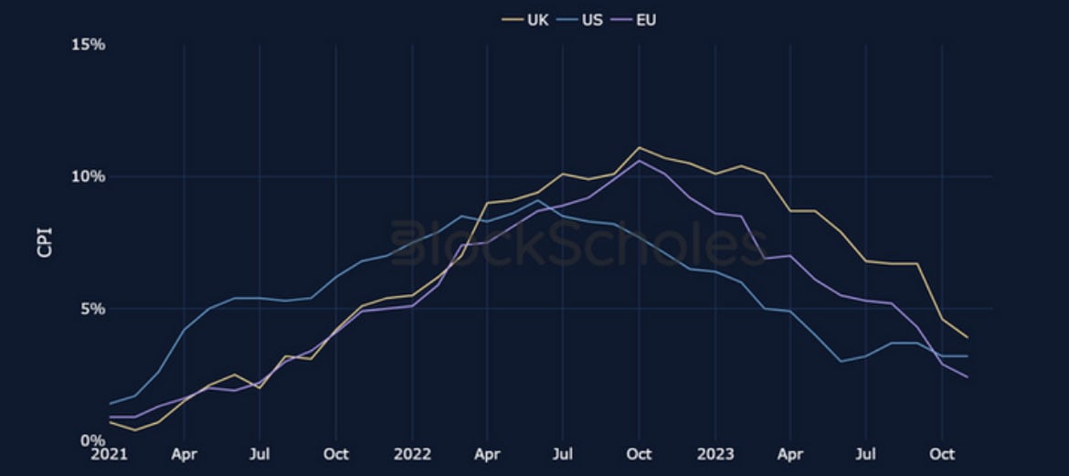
Figure 6 Monthly headline Consumer Price Inflation (all items) in the US (blue), UK (yellow), and Euro Area (purple, HICP) from January 2021. Source: BLS, ONS, Eurostat
Although it followed the lagged effect of the fastest pace of monetary policy tightening in decades, it is difficult to say that the fall in inflation is driven entirely by the actions of the central banks alone. The Federal Reserve, for example, did not begin to raise interest rates until as late as March 2022, and yet turned to a disinflationary path far earlier than in Europe. Inflation peaked noticeably higher in the UK and EU at the same time in October 2022, despite their central banks beginning their tightening cycles in December 2021 and July 2022 respectively. Once sparked, the path of inflation was impacted by different dynamics in each region.
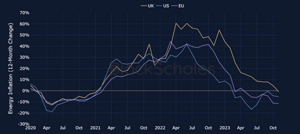
Figure 7 Monthly Energy Consumer Price Inflation in the US (blue), UK (yellow), and Euro Area (purple, HICP) from January 2021. Source: BLS, ONS, Eurostat
We see the larger-and-later peaks in inflation suffered by the EU and UK, compared to the US, as a result of the former’s larger dependence on imported energy and food prices. Both Russia’s war in Ukraine and the cut in oil supply by OPEC+ kept the prices of these items volatile. In particular, a post-Brexit UK’s reliance on imports left it especially vulnerable to these input costs. The US, by comparison, uses far less natural gas and was able to supplement the OPEC+ oil supply shortfall with its own production, allowing energy prices to fall sooner and faster.
However, a tighter labour market has kept US inflation above the 2% target level (and the level in the Euro Area), particularly in sectors whose input costs depend more heavily on wages such as Services. We have not yet seen a meaningful loosening in labour market tightness in the US that we would expect from such a swift tightening cycle, but neither have we seen strong evidence for wage spirals that drive inflation and wages up together in a feedback loop. It is only in the latter half of 2023 that we have seen signs of slowing in the number of payroll jobs added.
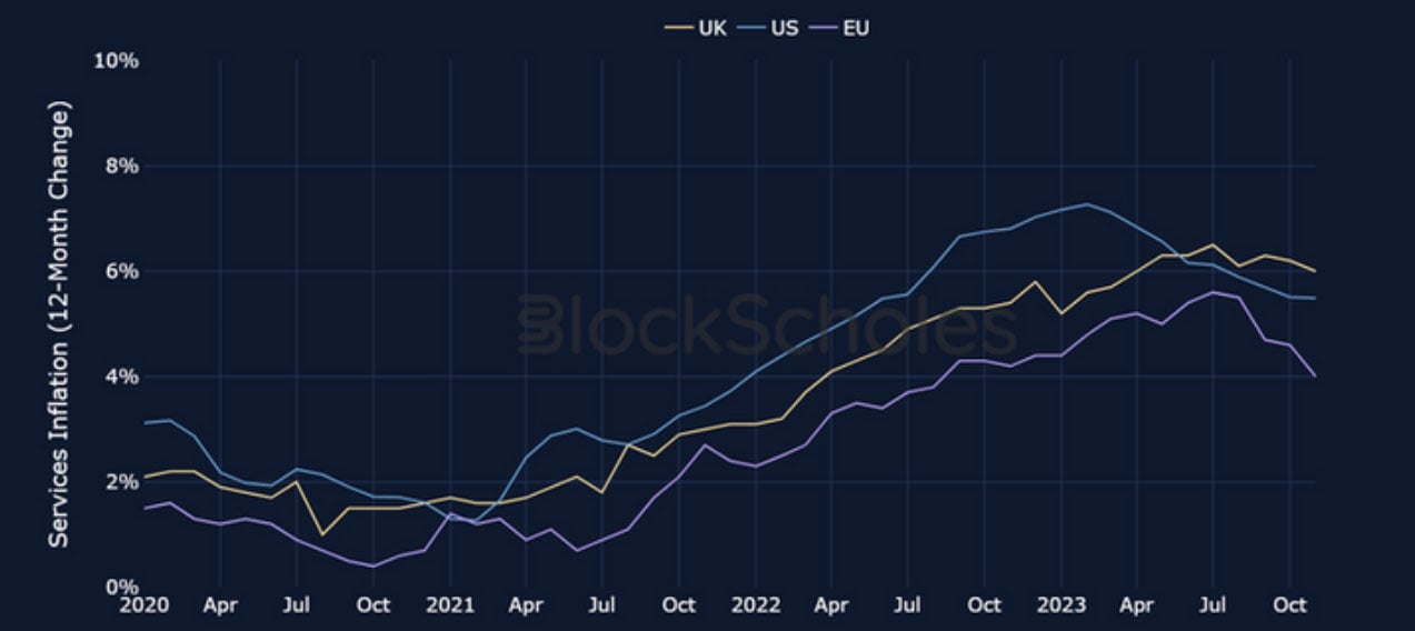
Figure 8 Monthly Services Consumer Price Inflation in the US (blue), UK (yellow), and Euro Area (purple, HICP) from January 2021. Source: BLS, ONS, Eurostat
Deceptive Growth Resilience
While the US has shown robust growth throughout this tightening cycle, its strength is misrepresentative of the almost unilateral slowdown in global growth. Key economic regions such as the United Kingdom, the European Union, China, and Emerging Markets have all experienced faltering recoveries from the pandemic slowdowns in their economies.
A significant portion of the growth in non-US regions appears to be merely a recovery towards pre- pandemic production levels, rather than an indication of new economic expansion. This is clearer when comparing GDP output to pre-pandemic trends, particularly in the EU and UK, where the initially strong positive recovery began to falter as early as Jan 2022. This suggests that while the weak growth rates have been more resilient than expected in the face of restrictive monetary policy, the positive effect of reopening will no longer support economic expansion.
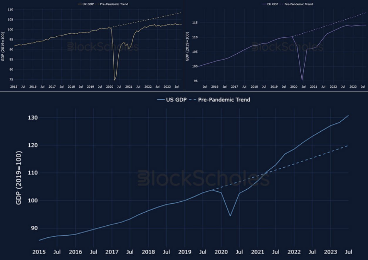
Figure 9 Quarterly GDP (normalised to Q1 2019) in (a) UK (yellow), (b) Euro Area (purple) and (c) US (blue) from January 2015, with the pre-pandemic trend (dotted lines) computed from average quarterly growth from 2015. Source: ONS, Eurostat, BEA
In contrast to the slowdown in other advanced economies, the US has exceeded its pre-pandemic growth path. It is only in the fourth quarter of this year that the pace of expansion has shown signs of moderating.
At first glance, the surprising robustness of the economy is also highlighted by the incredibly strong performance of US equities among their peers. The S&P 500, for instance, has returned 25% in 2023. However, this figure is also deceptive, as much of this growth has been fuelled by a subset of large-cap, technology stocks. If we instead consider an equal-weighted index of the same stocks in the S&P 500 (shifting the weight away from large-cap tech) the performance drops to just Y%, having traded flat on the year as late as November.
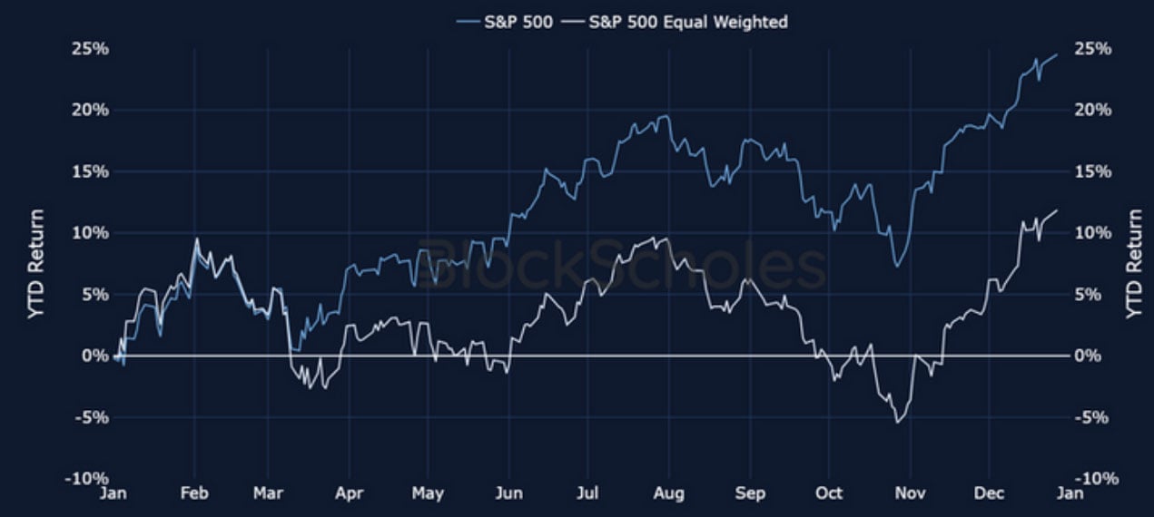
Figure 10 Daily return of S&P 500 (blue) (all items) in the US (blue), UK (yellow), and Euro Area (purple, HICP) from January 2021. Source: Yahoo Finance
The surge in technology stocks has borne the brunt of much of 2023’s equities performance, with smaller-cap stocks reporting little to no growth for much of 2023. Even among a subset of 10 top- performing tech stocks, performance was led by AI-driven bullishness in NVDA and META. It suggests that it is the advent of AI tools that offer real advantages to productivity that has supported an otherwise laggard asset class.
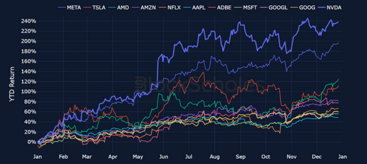
Figure 11 Monthly headline Consumer Price Inflation (all items) in the US (blue), UK (yellow), and Euro Area (purple, HICP) from January 2021. Source: BLS, ONS, Eurostat
The clear trend in equities will certainly continue into the near future, but any bullishness will have to contend with the likely path of monetary policy and what its movements mean for risky assets more generally. The strong growth in the US economy is at odds with its position in the tightening cycle. FOMC participants have already begun to consider a pivot towards cuts in 2024, targeting the holy grail in a soft landing. However, they do so while equities sit near all-time highs and GDP has more than recovered from its pandemic-induced slump, a contradiction of previous cycles that have seen the Fed forced to cut rates to stimulate the economy.
Pivoting from the Pivot
Between March 2022 and July 2023, the Federal Reserve cumulatively delivered 525 basis points of hikes to the federal funds rate target range over the course of the most aggressive tightening cycle in decades. After pausing at the July meeting, however, the Federal Reserve’s communications first shifted towards “higher-for-longer” rhetoric, causing longer-term treasury yields to rise and therefore reducing the inversion of the yield curve in a broader rout in long-maturity bonds. Markets also began to price for a final year-end hike as growth remained resilient and there was little change in employment.
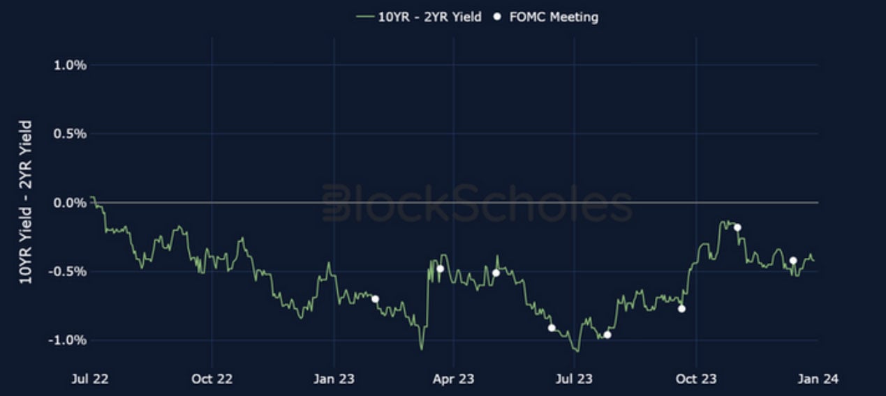
Figure 12 Monthly headline Consumer Price Inflation (all items) in the US (blue), UK (yellow), and Euro Area (purple, HICP) from January 2021. Source: BLS, ONS, Eurostat
However, the November FOMC meeting marked another shift in sentiment. With it came a reversal in the upward trend of long-term yields as markets marked down the probability of a final hike in 2023. Having settled on the idea of higher long-term rates, FOMC participants pivoted to considering the possibility of cuts at its December meeting at a surprising pace. In its final Summary of Economic Projections (SEP) dot plot of the year, the median FOMC participant forecast 75 basis points in interest rate cuts by the end of 2024.
The Fed’s newly dovish position is not itself unreasonable given recent economic data releases. The final quarter of 2023 saw the first signs of slowing growth and loosening in the labour market, and an unquestionably downward trend in inflation. Instead, it is the Fed’s rapid shift in communication that has seen the market correct its forecasts so decisively. In a matter of days, the narrative changed from a stance of keeping rates “higher for longer” to hinting at rate cuts.
Historical Hints for the Outlook
As the Fed has now begun the conversation of when to begin easing monetary policy, it is helpful to consider what happened in previous easing cycles. To do so, we plot the value of several asset classes as a ratio to the value they recorded on the date of the final hike in the previous 5 hiking cycles, which are shown below.
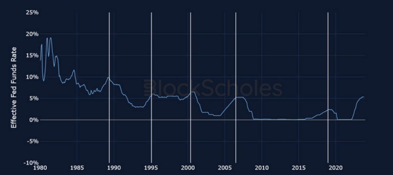
Figure 13 Monthly headline Consumer Price Inflation (all items) in the US (blue), UK (yellow), and Euro Area (purple, HICP) from January 2021. Source: BLS, ONS, Eurostat
The clearest response to the end of a hiking cycle is by US equities (as measured by the performance of the S&P 500), which failed to rally in the immediate aftermath of only one of the historical hiking dates that we have considered, May 2020. In all other cases considered, the index either continued its already upward trend (as it did in 1989) or began a rally following the final hike. This indicates that in those cases, the fact that the tightening cycle was near its end was known by the market. However, the length of each rally was different, and we note that the strong performance in the 1995 case soon led to the poor performance following the last hike in 2000.
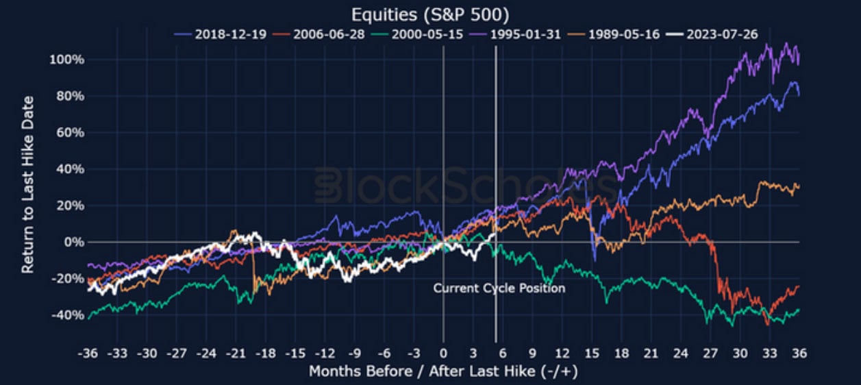
Figure 14 Monthly headline Consumer Price Inflation (all items) in the US (blue), UK (yellow), and Euro Area (purple, HICP) from January 2021. Source: BLS, ONS, Eurostat
The path of equities in the current cycle briefly reported the worst performance 3 months after the date, possibly as a result of less clarity that there were no more hikes to follow. Ignoring the 2000 case, previous cycles indicate that we should expect the current rally to continue further into 2024, after which historical paths begin to diverge.
However, the final hike of the 2000 cycle bears some similarities to our own. Both final hikes occurred while the S&P 500 was near all-time high levels, and neither cut was immediately followed by a recession, as the recession of 2001 was not officially recorded until nearly 12 months later. This is, at a minimum, one example that leads us to worry that we are not out of the woods just yet.
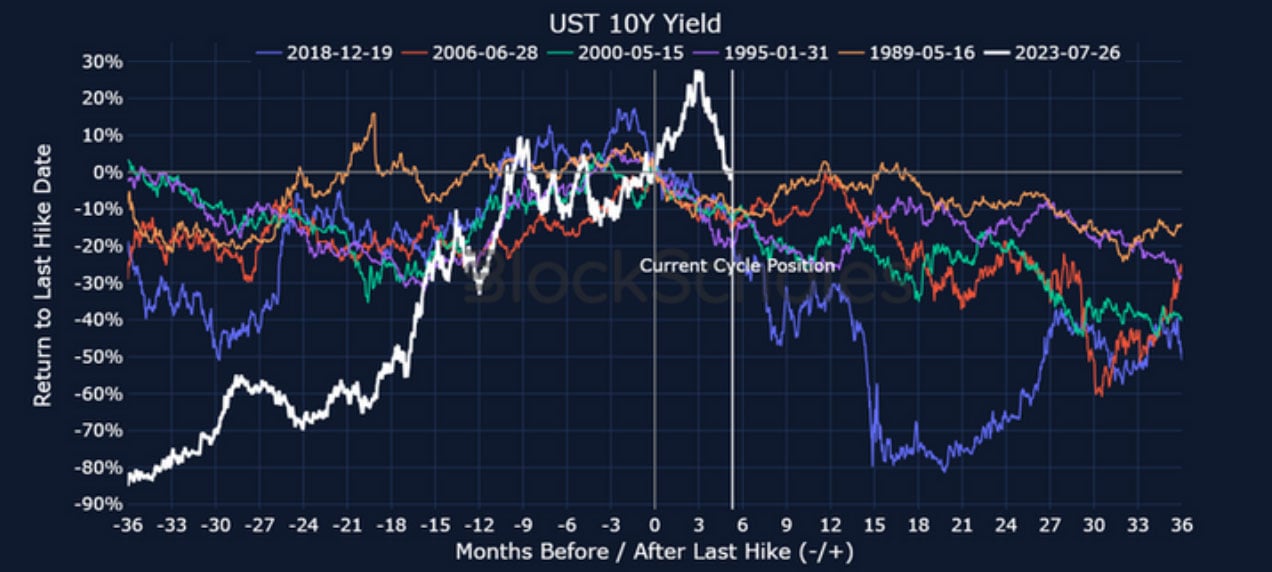
Figure 15 Monthly headline Consumer Price Inflation (all items) in the US (blue), UK (yellow), and Euro Area (purple, HICP) from January 2021. Source: BLS, ONS, Eurostat
One marked difference to previous hiking cycles is in the path of the 10Y US treasury bond yield. Historically there has been a clear downward trend in long-term yields in response to the final hike date as a result of the market repricing the path of monetary policy. This time, however, 10Y bond yields first sold off strongly, in stark contrast to the end of each of the five previous hiking cycles as the Fed touted “higher-for-longer” rhetoric. It was only 3 months later, in early November, that they began to plunge in accordance with historical behaviour.
However, we do not see as clear a response in Gold or the strength of the dollar (as measured by the DXY index) in any of the historical cycles except for 2018, when Gold rallied (charts displayed on the following page). Not only is each cycle different to each other, but within each cycle the response is not a sustained move in either direction in response to the hike announcement.
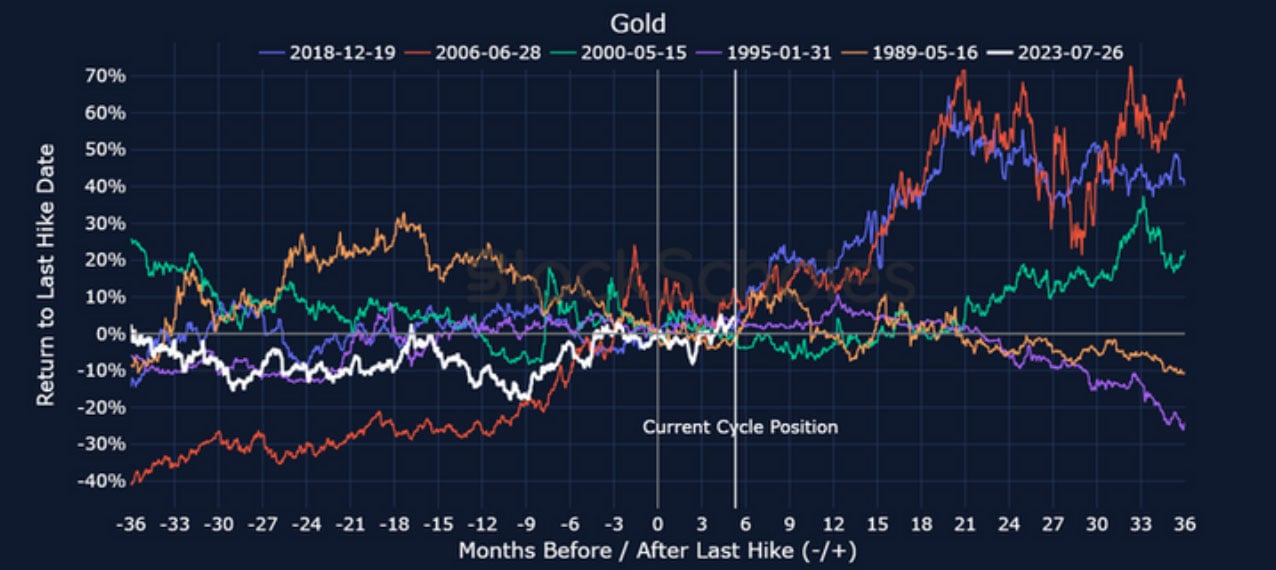
Figure 16 Monthly headline Consumer Price Inflation (all items) in the US (blue), UK (yellow), and Euro Area (purple, HICP) from January 2021. Source: BLS, ONS, Eurostat
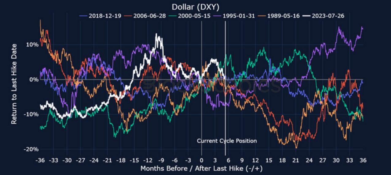
Figure 17 Monthly headline Consumer Price Inflation (all items) in the US (blue), UK (yellow), and Euro Area (purple, HICP) from January 2021. Source: BLS, ONS, Eurostat
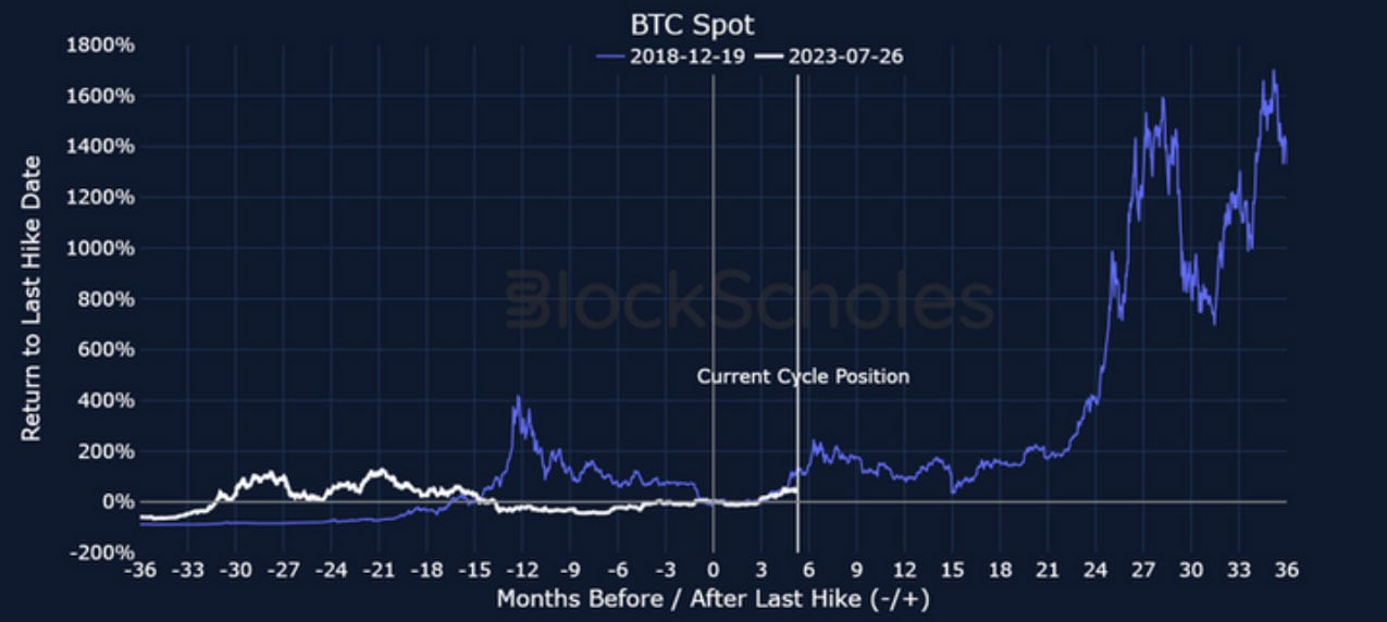
Figure 18 Monthly headline Consumer Price Inflation (all items) in the US (blue), UK (yellow), and Euro Area (purple, HICP) from January 2021. Source: BLS, ONS, Eurostat
There is reliable exchange data for BTC beginning in 2014, meaning that we can compare its performance before and the last hike in 2018 to its path in the current cycle. Then, BTC rallied strongly to twin all-time highs in April and November 2021 two years later. However, this gives just one data point and it is unclear what effect macroeconomic factors had on its price.
To augment a better understanding of BTC’s likely path (and that of the wider crypto-asset market) in the uncertain macro climate to come, we can compute its evolving correlation to other assets. In the chart below, we show the rolling 180-day correlation of BTC daily returns to those of Gold, US equities, and the yield offered by a 10Y US treasury note.
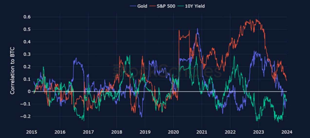
Figure 19 Monthly headline Consumer Price Inflation (all items) in the US (blue), UK (yellow), and Euro Area (purple, HICP) from January 2021. Source: BLS, ONS, Eurostat
Bitcoin’s high correlation to US equities began with the Covid-19 crash in March 2020. At its height in January 2023, returns of the largest crypto-asset moved with a near 60% correlation to those of equities in January 2023. This followed a long year of both reacting sensitively to changes in monetary policy in the US. However, the correlation has fallen dramatically and consistently over the last year.
A move away from equities has not meant a move towards safe-haven assets like Gold either. What is less clear is how these relationships will develop. If (like at the end of several previous hiking cycles) we expect equities to sustain their current rally, it is difficult to imagine that Bitcoin would not regain its risky-asset status and follow them higher for similar reasons. However, it is less clear to forecast its reaction in the case that a recession is not avoided. As with equities, we foresee significant volatility in the year to come.
Historically, we have come to expect inflation-response tightening cycles ending with the Federal Reserve moving quickly to cut interest rates to navigate a recession. Now, it seems that both the Fed and the market alike can scarcely believe that a soft landing has been achieved. The uncertainty traded in bond markets, less-than-complete job tackling inflation, resilient GDP growth, tight labour markets, and equities balancing disconcertingly near all-time high levels all point to an uneasy hope of success.
Given these differences, the central question for the next 12 months revolves around the uniqueness of the current situation: Is this time really different? We believe that this question will lead to heightened volatility across asset classes, particularly in risky assets like equities and cryptocurrencies. A soft landing is possible, and falling inflation, the strength in the economy, and unfazed employment levels in the US are each a testament to the increased chance of pulling it off. However, the more the market prices for success, the sharper and more painful the repricing will be should the path prove to be more volatile than expected.
AUTHOR(S)
Trading with a competitive edge. Providing robust quantitative modelling and pricing engines across crypto derivatives and risk metrics.