

One of the main assumptions of the Black-Scholes option pricing model is that the returns of an asset/stock are normally distributed, and that future underlying prices therefore are lognormally distributed. In reality, the extremes (or tails) of the distribution curve are often fatter than a normal distribution would suggest. Meaning extreme moves happen more often than a normal distribution would suggest. This leads to something called the volatility smile.
A distribution curve displays how some set of data is distributed across a range of values. When we talk about a normal distribution, this is the type of distribution curve we are talking about.
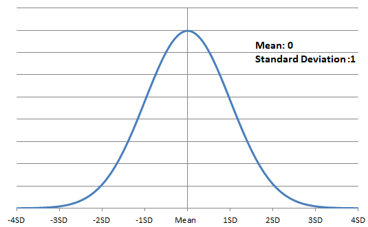
This is actually the standard normal distribution, with mean of 0 and standard deviation of 1.
And this is an example of a lognormal distribution, with a mean of 1 and a standard deviation also of 1.
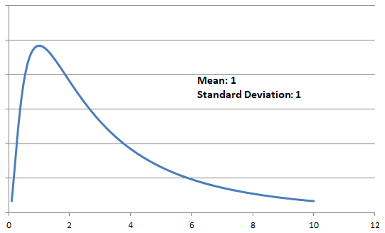
Lognormal distributions eliminate the possibility of negative values, and so are more suitable to describe the price of an asset than normal distributions (which can be negative). Returns in a given time period though can of course be negative. For example the price of an asset could increase by 10% in a day (giving returns of +10%), or it could decrease by 10% in a day (giving returns of -10%).
If returns did follow a normal distribution, and the Black-Scholes model perfectly modelled the real world, the fair IV level for each strike in a particular expiration would be the same, meaning a flat line for IV. For now though, just be aware that the implied volatility figure is rarely the same for each strike in a particular expiration, but instead will often create a smile shape when plotted on a chart.
Here we have a chart of the implied volatility for each strike price in a given expiration of an asset that has a current price of $100.
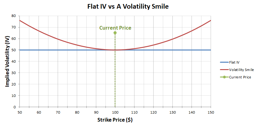
The blue line on this chart illustrates what it would look like if IV were the same for each strike price. For every strike price, all the way from $50 to $150, the implied volatility is 50% in this example.
However, in the real world, larger moves can happen more often than is predicted if we assume a normal distribution, due to the fatter tails of the distribution mentioned earlier. Many market participants (that is, traders buying and selling options), are aware of this, and so they tend to price options towards the extremes of the curve higher to account for this. This leads to a ‘smile’ in the implied volatilities of each strike as we see here (in red).
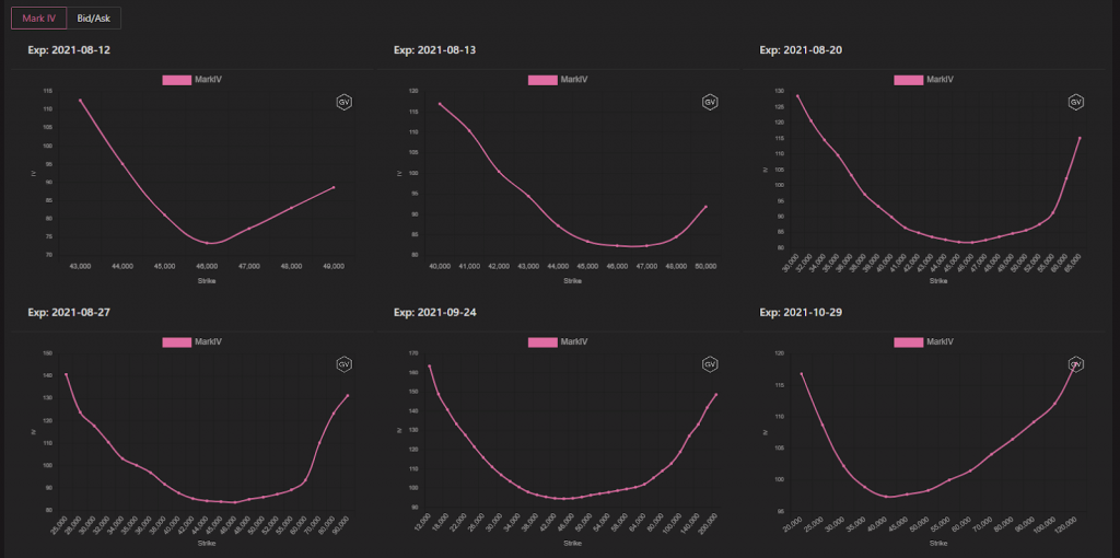
Let’s look at a live example on Deribit. This is the bitcoin option chain for the 27th August 2021 expiration.
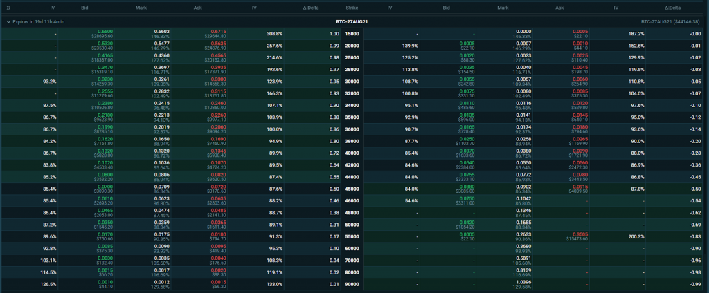
We’ll use the IV from the mark price columns to study the implied volatilities of each strike. The underlying price is just over $44,000 here, so the $44,000 strike is at the money. The implied volatility of this strike is 85.94%. If we move down in strike price (which is up in the table) we can see that the implied volatility increases the further away from the ATM strike we move. The same is true if we move up in strike price (down in the table). So as we move away from the ATM strike in either direction, the IV increases.
If we plot these values in the same way we displayed in the previous theoretical example, we get this chart.
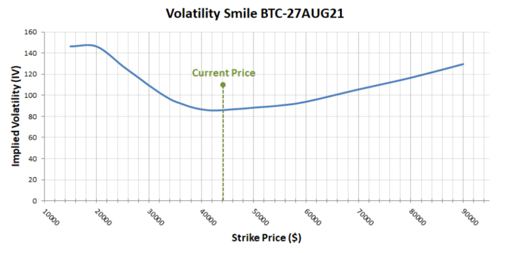
As expected we get a form of smile in the implied volatilities, meaning the options further away from the current price are more expensive than if they were all priced using the IV figure for the ATM strike. Traders are making adjustments compared to the black scholes model to account for the model’s limitations.
This particular smile is not symmetrical though. As well as traders accounting for the fatter tails, supply and demand still plays it’s usual role in how different options are priced, so there is no rule that says what shape this curve needs to take. If traders are fearful of a large decrease in underlying prices, they may push up the price of puts relative to calls. Conversely if traders are convinced of an upcoming increase in price, they may bid calls up instead.
To describe the shape of the curve mathematically, traders may use skew and kurtosis. Skewness and kurtosis are measures of how a distribution differs from a normal distribution. Skew measures the symmetry of the distribution curve, while kurtosis measures how fat the tails are.
While we will be coming back to some of this in later sections, the descriptions of distributions given in this course are by no means complete, so if you’re still feeling confused about distributions, I would highly recommend doing some further reading about them online. There is plenty of free information available on them. It’s only high school level maths so you don’t need to be a genius to understand it, and it’s well worth getting at least a basic grasp of what they are and how they work because it’s useful knowledge for more than just trading.
The volatility smile on other assets
This volatility smile phenomenon is not isolated to the world of cryptocurrency. Here we have an option chain I’ve pulled from tastyworks for SLV, the silver ETF.
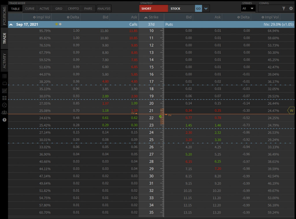
The current underlying price is about $21.83, so the $22 strike is ATM. The IV of the $22 call is 24.61%, and we can see in both directions that the IV percentage increases as we move further away from the current price.
If we plot these values in the same way as previously, we get this chart.
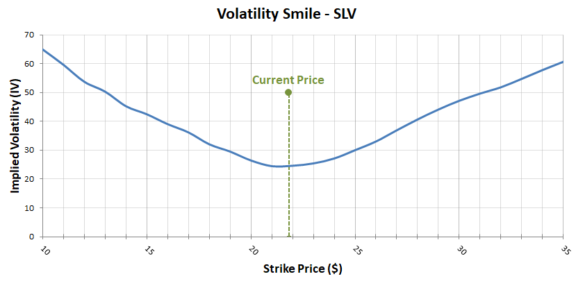
As you can see, the same behaviour can be seen that creates the volatility smile, instead of having flat IV across all strikes. The curve also looks more symmetrical than in the bitcoin example, forming a smile shape.
Which IV level is quoted?
With many different IV levels on the same expiration date, you may be asking yourself which IV is ‘correct’, or which one should be used when discussing volatility. Obviously if you are discussing a specific option, you can use the IV of that option. More generally though, when people talk about current volatilities, or the implied volatility of a specific expiration, they are usually referring to the IV level of the ATM strikes. This would be the $44,000 strike price in the previous bitcoin example, or roughly 86%, and the $22 strike in this SLV example, or roughly 24.6%
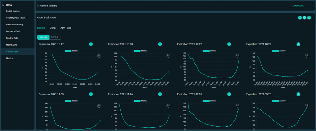
When you want to look at all the volatilities together though, it’s possible to see them in the option chain, but this is far from ideal if you want to see the shape of the curve; whether it’s a symmetrical smile shape, or skewed. It’s often more beneficial to chart the curve as we have done in these examples. It’s possible to do this yourself using the API, either directly or by using a tool like Cryptosheets. There are also web based tools that do all this work for you, and display the volatilities for each expiration, as well as many other useful charts and statistics. One such tool is Genesis Volatility, which you can find at gvol.io.
With gvol you can display these charts by strike price or by delta if you prefer. This data from gvol is also now embedded directly into the Deribit UI on the ‘Options Data’ page.
Summary
While it’s not always necessary to know all the maths behind it, it is useful to be aware that IV levels are unlikely to be flat across all strikes on a given expiry. They will often create a smile or skewed smile shape, with the lowest point usually being with the ATM strike (or close to it).
It’s also useful to be aware of the possible reasons for this. This can include traders compensating for fatter tails in the distribution of returns in the underlying asset, but also the current sentiment affecting supply and demand for calls and puts.